Project

David Morales Vega

Sector Technology / Professional Portfolio
Client David Morales Vega — Solutions Architect & Tech Lead
Location Oruro, Bolivia
Year 2025
David Morales Vega - Solutions Architect professional portfolio

Client and Idea

A profile that does not fit a template — and a digital presence to match

Visual identity
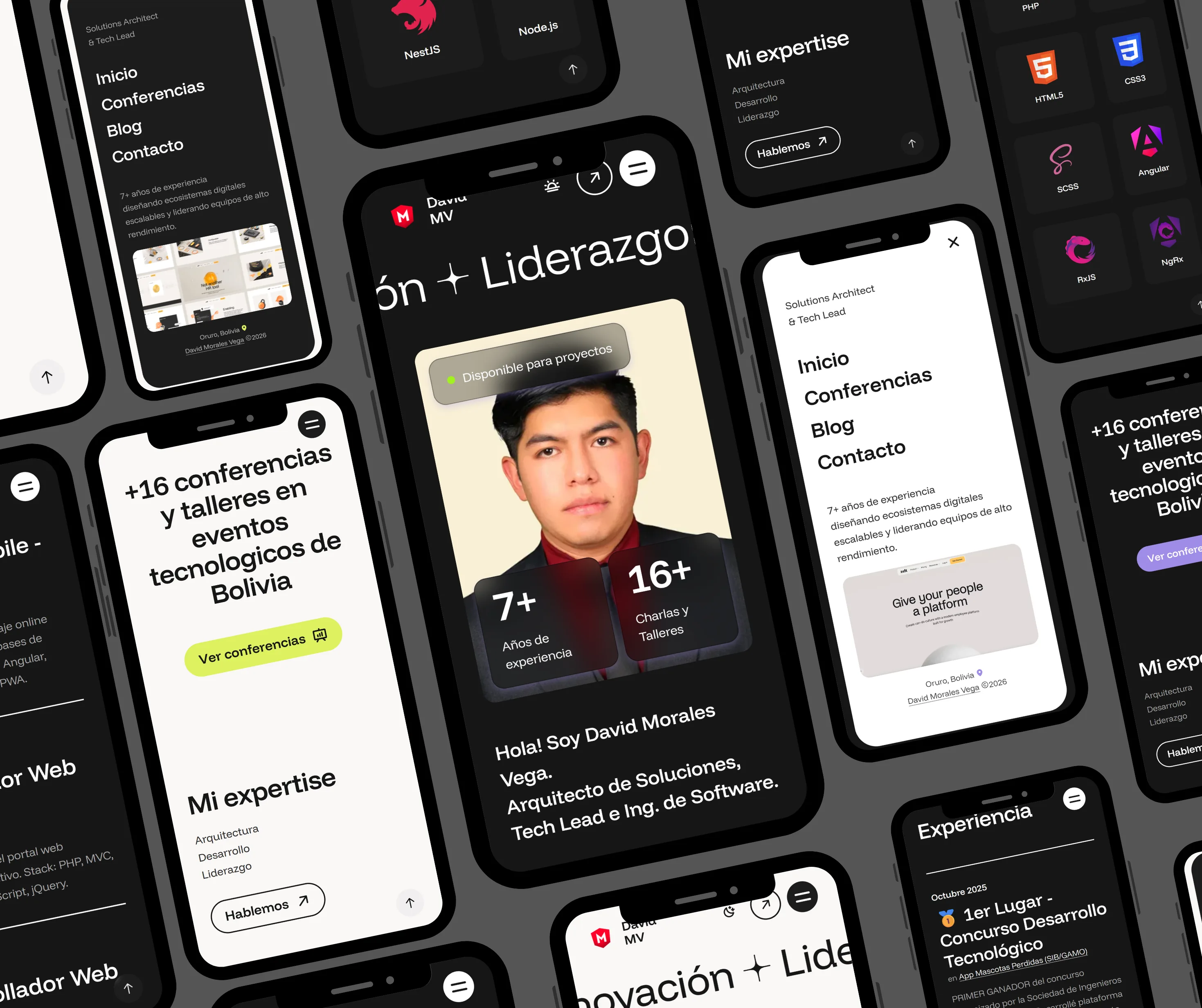
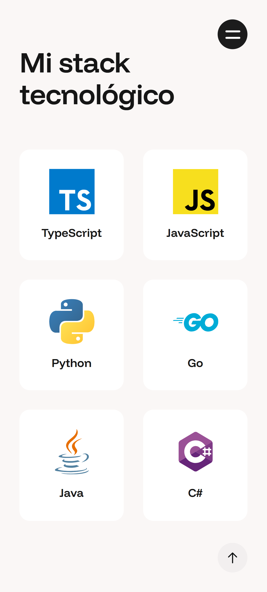
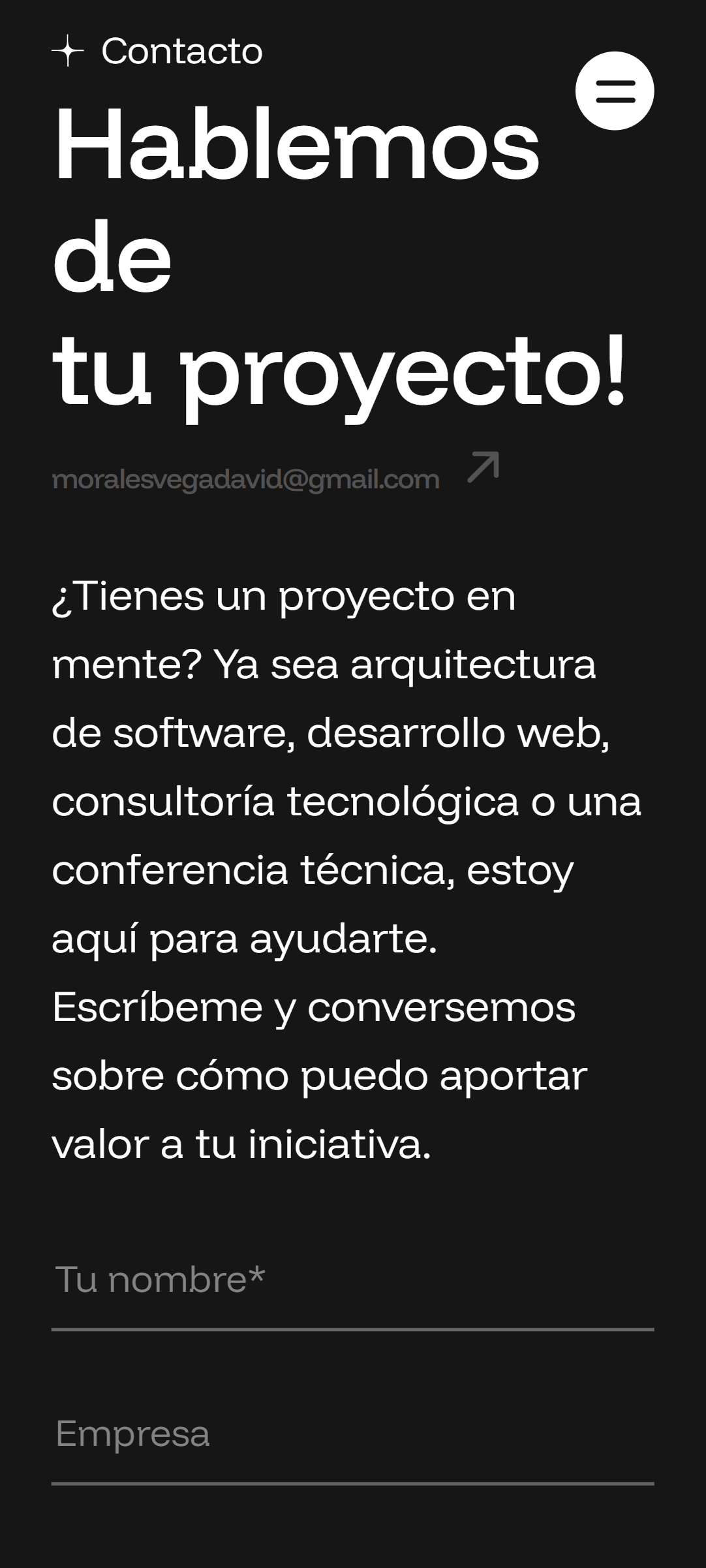
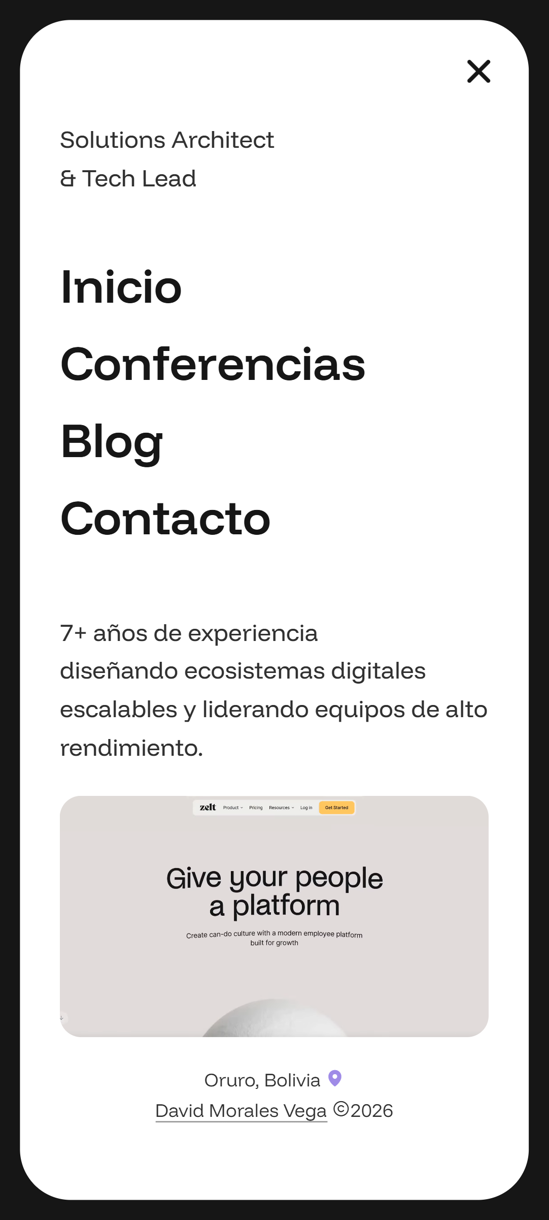
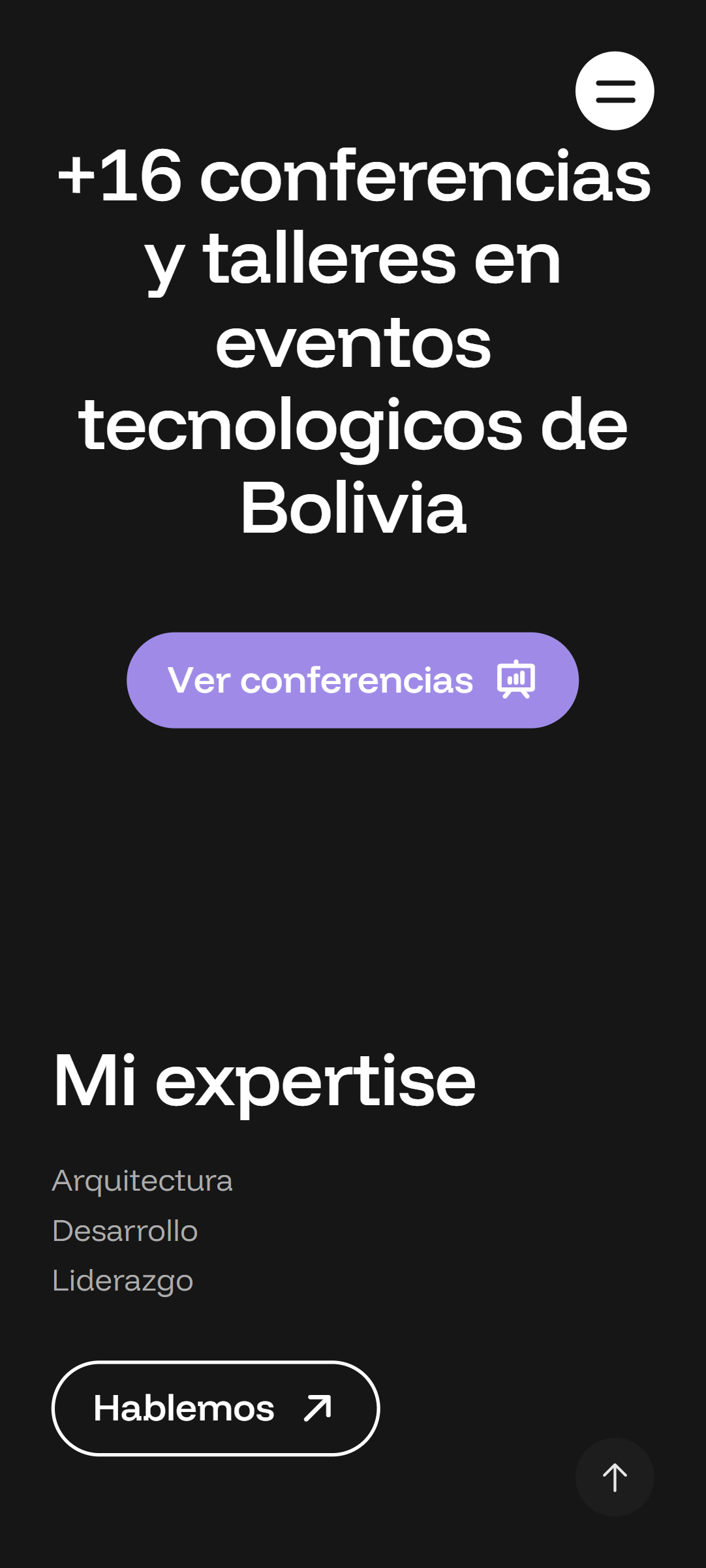
Responsive design

David Morales Vega is a Solutions Architect, Tech Lead, speaker with more than 16 international talks — and a qualified lawyer. A profile that complex is not communicated by a PDF CV or a generic template. He needed a digital platform that did justice to his track record and established him as an authority before anyone looked him up on LinkedIn.

The Challenge

David's profile overflows every category. He is an engineer, a lawyer, a solutions architect and an international speaker. The challenge was a portfolio that conveyed all that depth without overwhelming, that felt premium from the first scroll, and that worked as a real conversion tool — for speaking invitations and for senior consulting alike.

What We Built

  • A portfolio that tells a story rather than listing skills
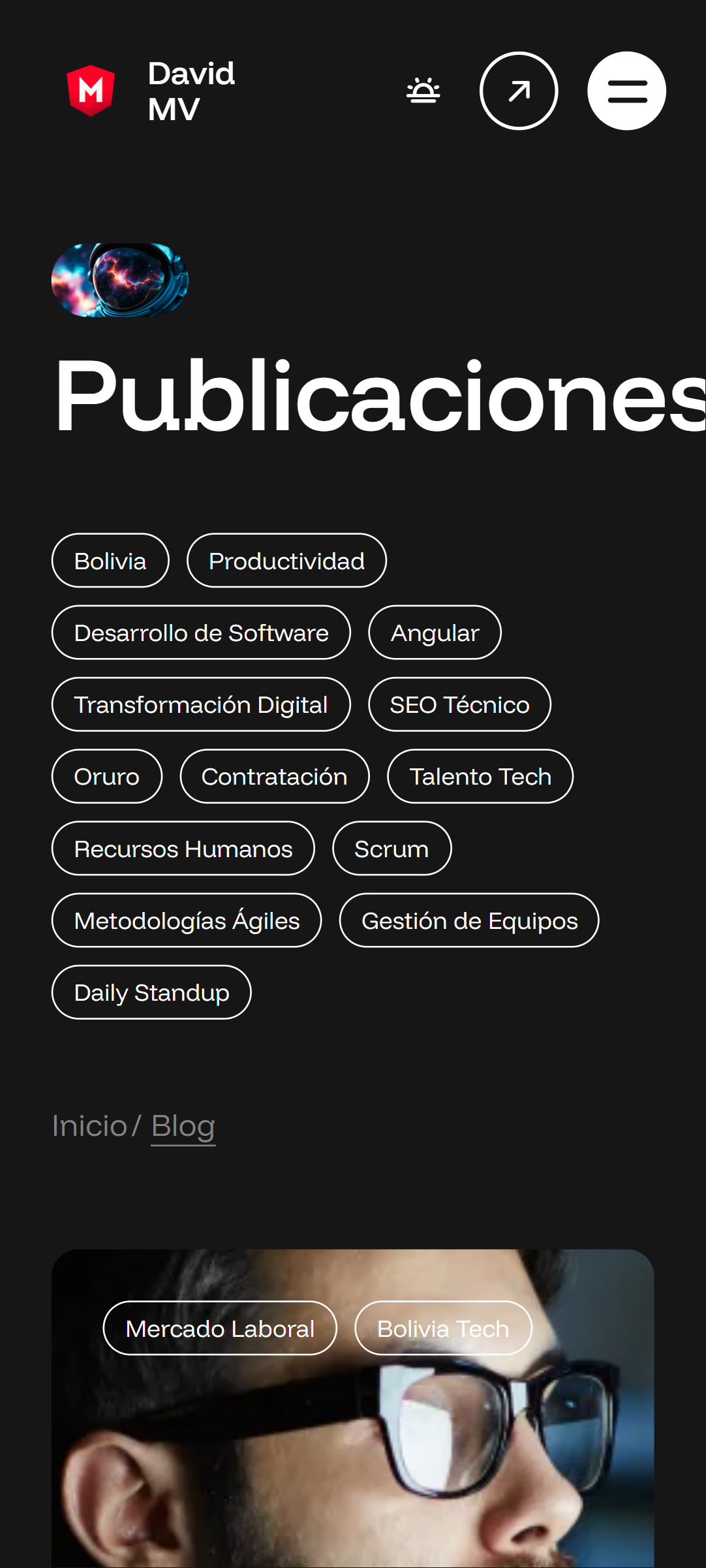
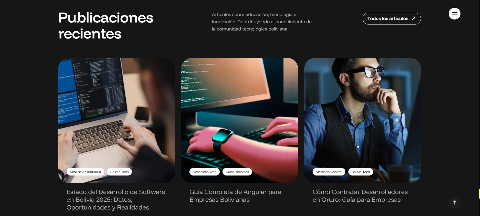
  • An integrated blog for technical articles and thought leadership
  • A section covering 16+ talks with detail on each event
  • Legal-Tech consulting: the unique bridge between his dual training
  • Premium GSAP animations that mirror his professional attention to detail
  • Thorough SEO: Google understands exactly who David is
  • Premium dark design conveying technical sophistication
  • Installable as a PWA and optimised for any device

16+

Talks
International

2

Degrees
Professional

130 h

Development

100+

Daily Visits

100%

Organic Ranking

Portfolio sections

Each section was designed to communicate a different dimension of David's profile: his technical experience, his authority as a speaker and his consulting capability. There is no filler — every block has a conversion purpose.

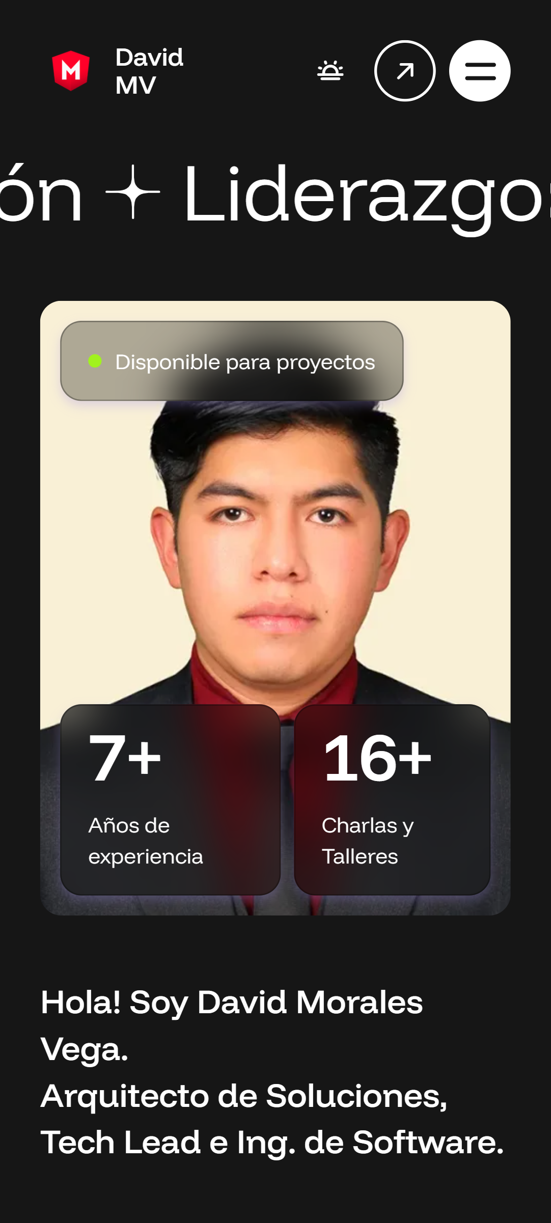
Hero with video background
Marquee animations

Hero & Personal Brand

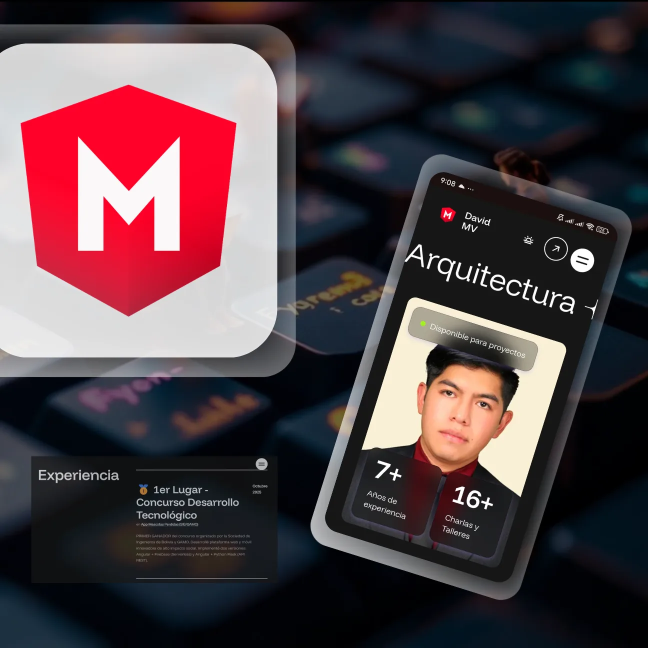
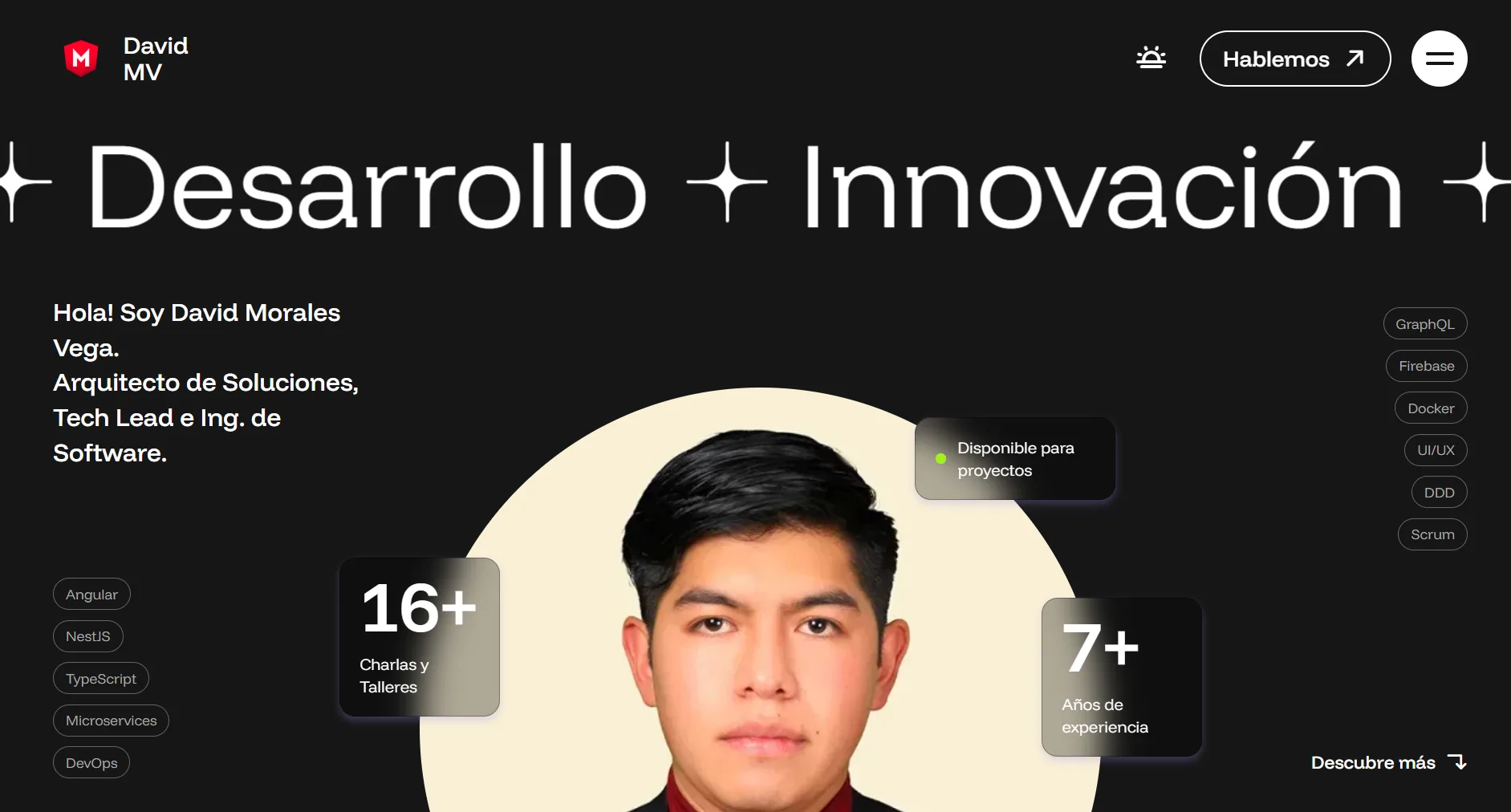
The first screen defines perception. The hero of David's portfolio uses GSAP entrance animations, a keyword marquee that communicates his stack instantly, and a typographic hierarchy that makes clear who he is before the visitor scrolls.

The premium dark design is not an arbitrary aesthetic choice — it reinforces the technical sophistication that consulting clients and event organisers expect to see.

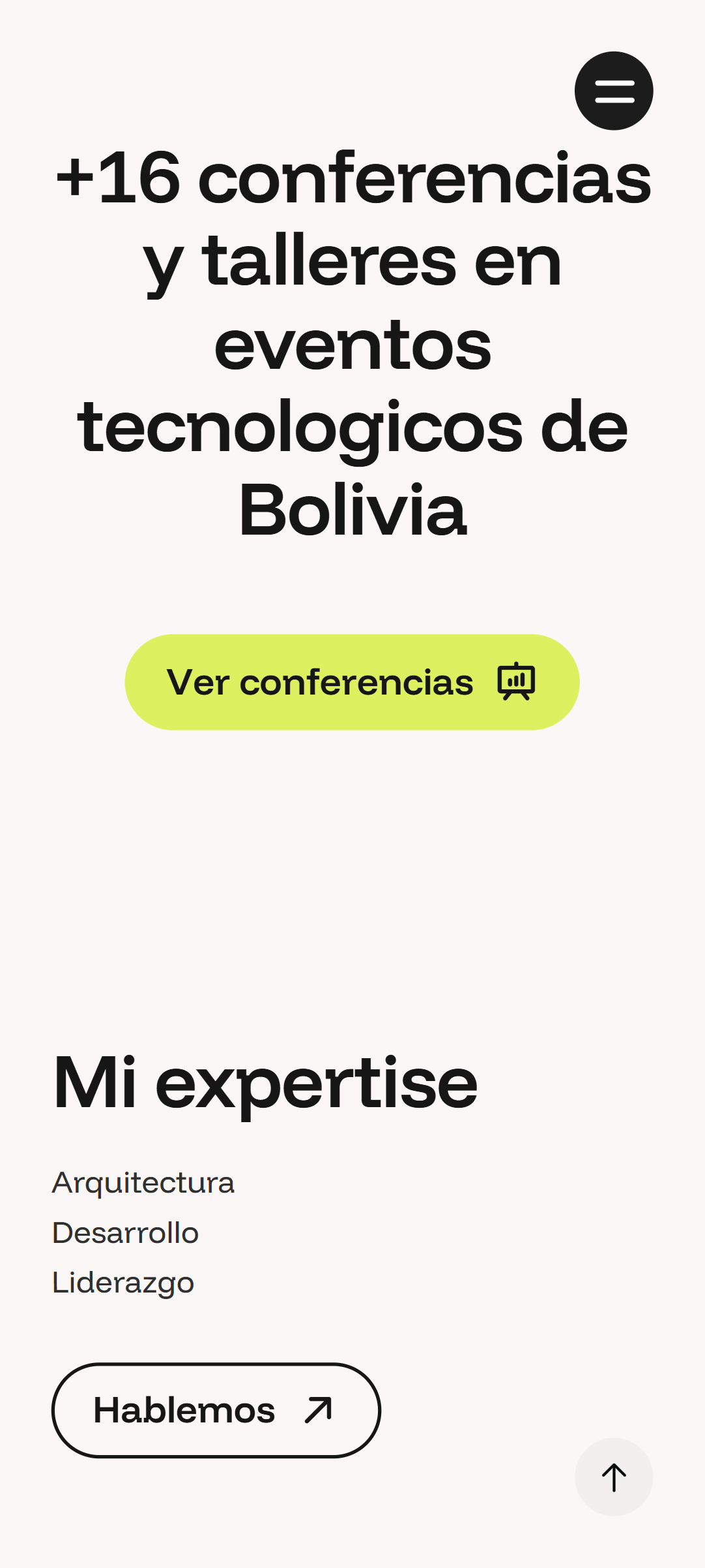
Speaking section
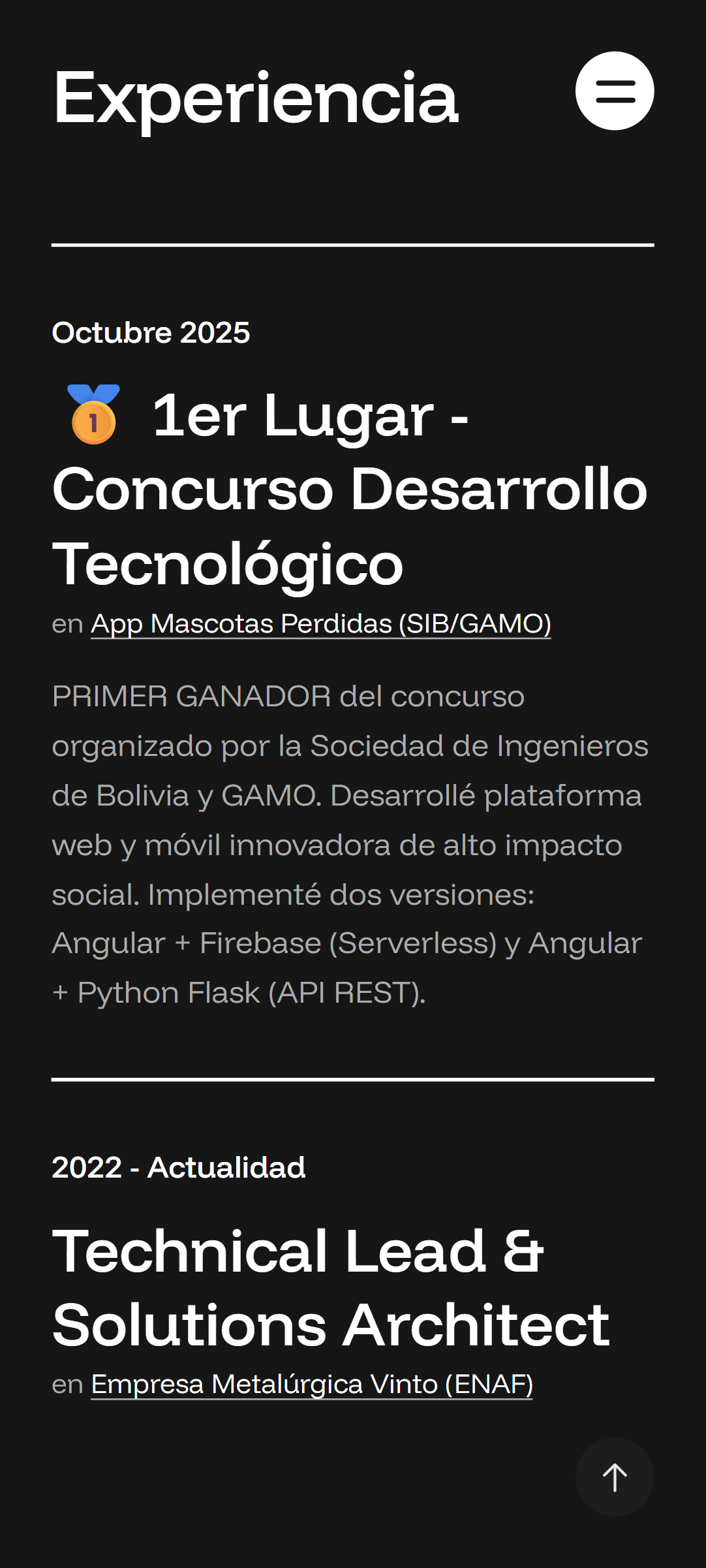
Experience timeline

Talks & Experience

16+ talks across Bolivia and Latin America is not something that fits in a LinkedIn bullet point. The speaking section presents each event with an image, description and context — turning David's history into undeniable proof of authority.

The professional experience timeline walks through his career visually and progressively, creating a sense of depth a CV could never convey.

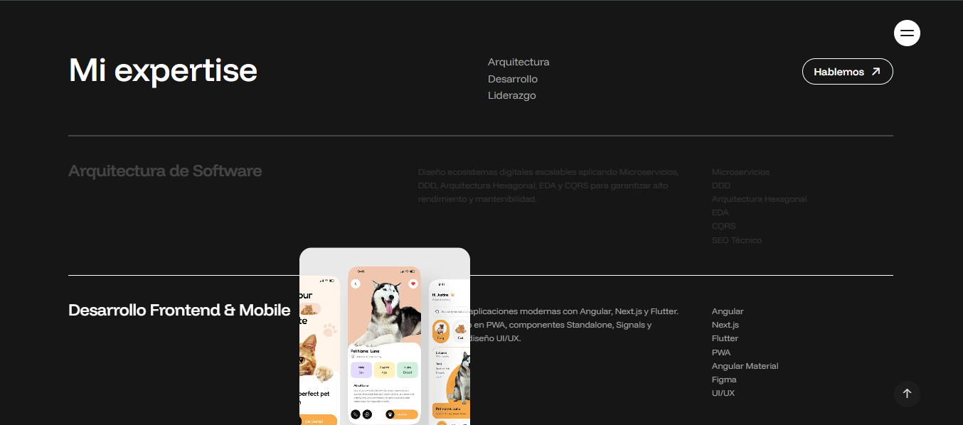
Consulting services
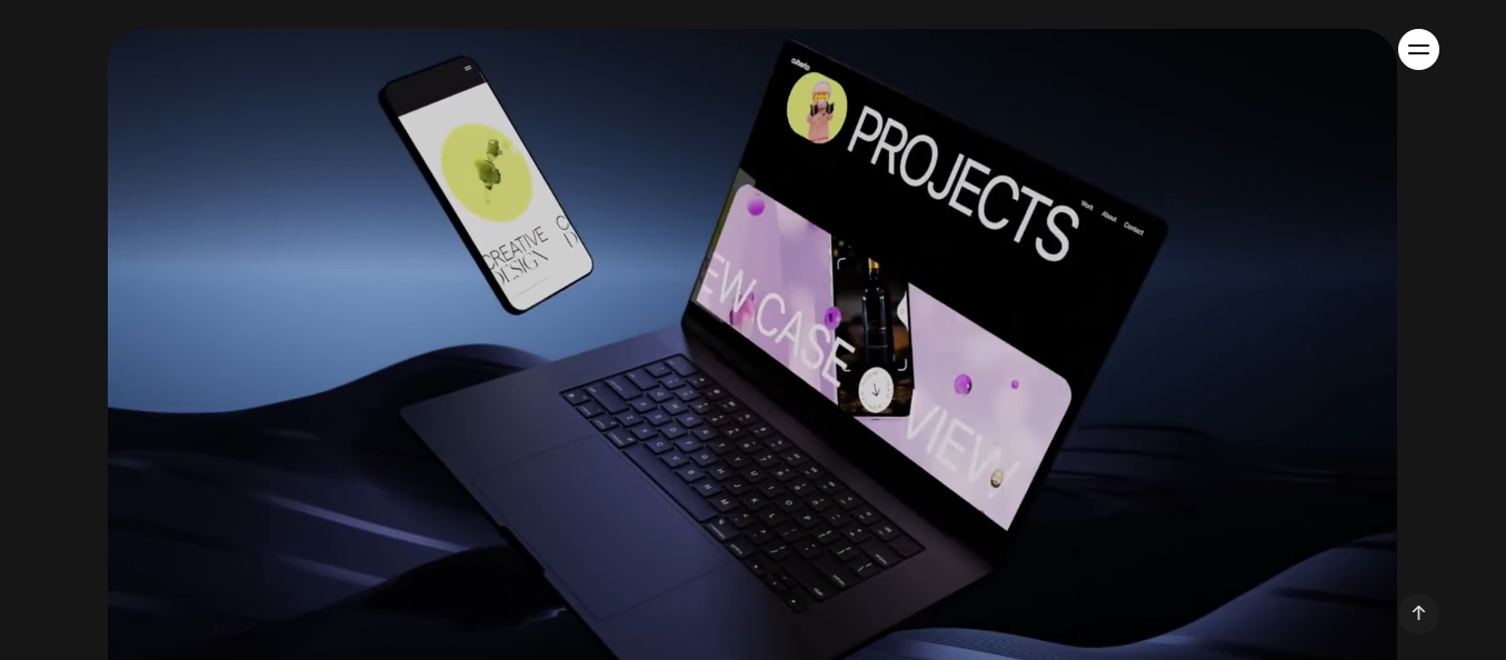
Full site view

Blog & Consulting Services

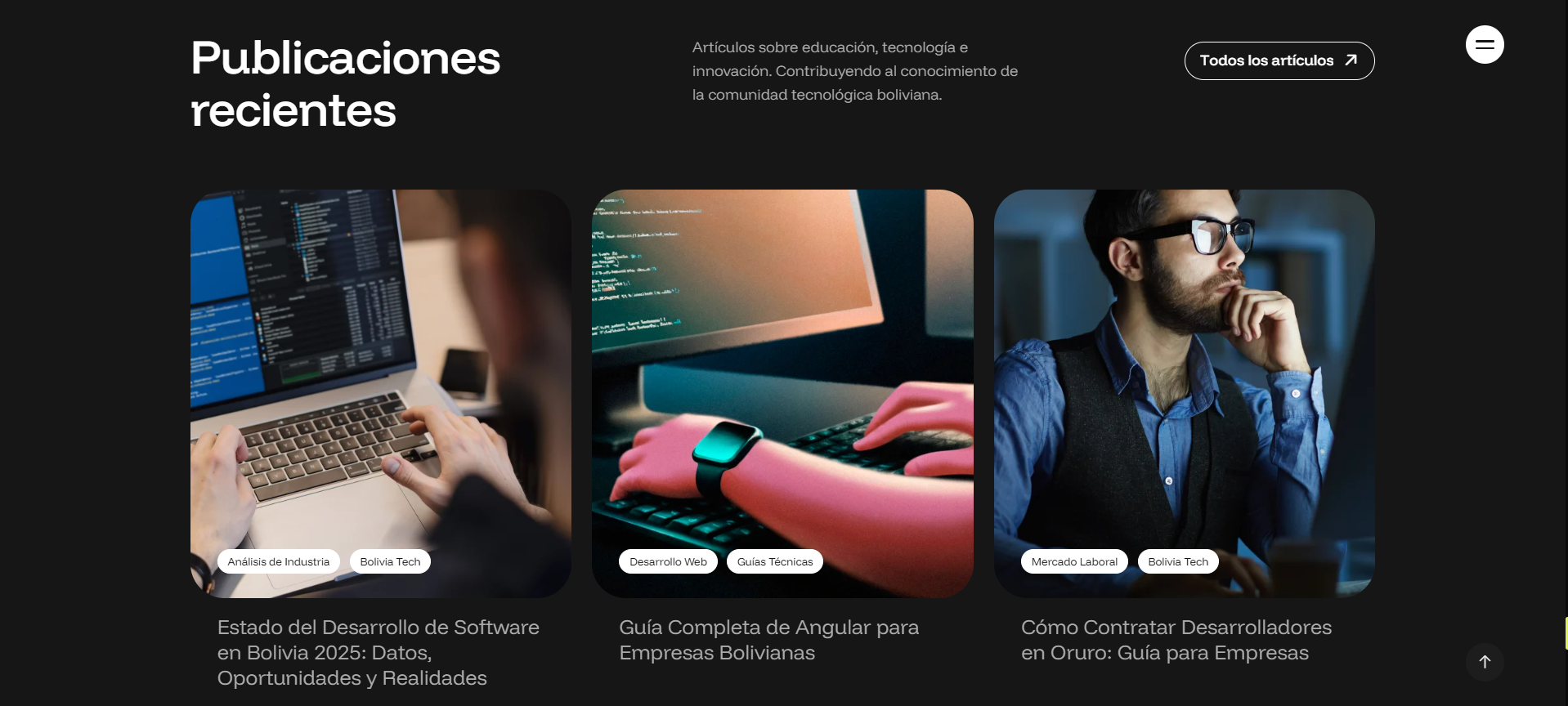
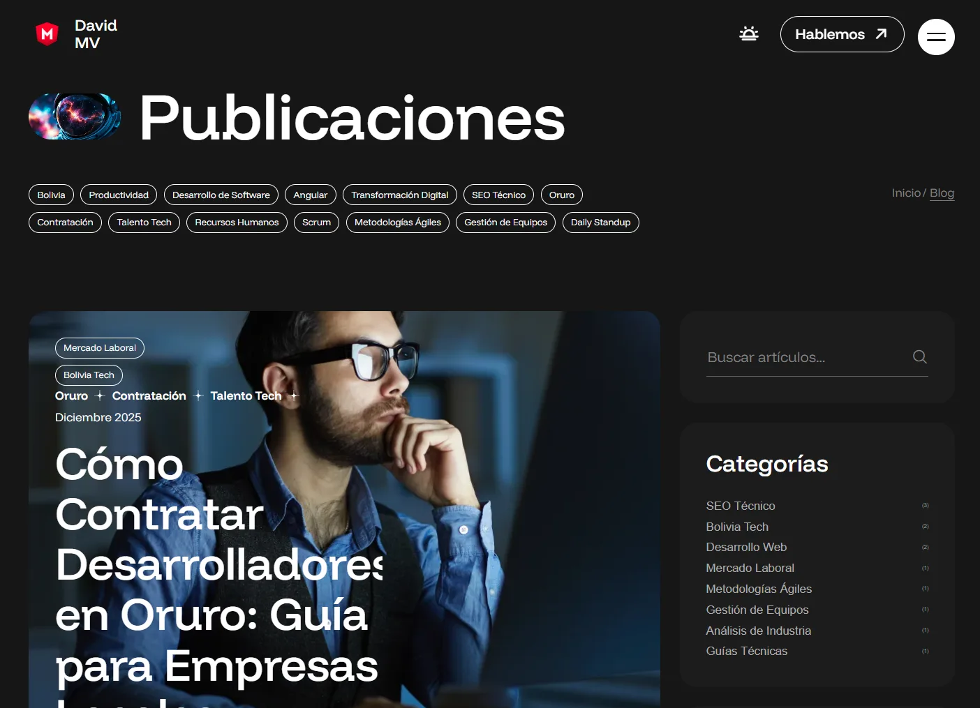
The integrated blog gives David his own voice in the digital ecosystem: he publishes technical articles, architecture reflections and Legal-Tech analysis independently, without relying on anyone else.

The services section presents his consulting offer — including the unique Legal-Tech differentiator that combines his engineering and legal training — clearly and frictionlessly, turning visits into enquiries.

UX/UI Design

Visual identity
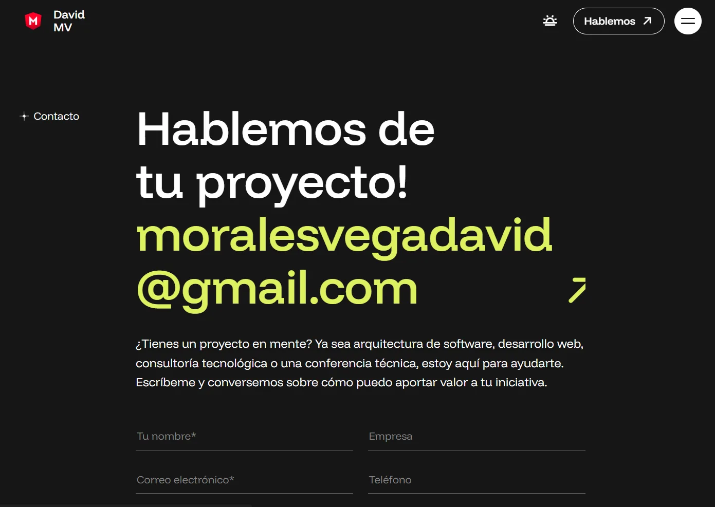
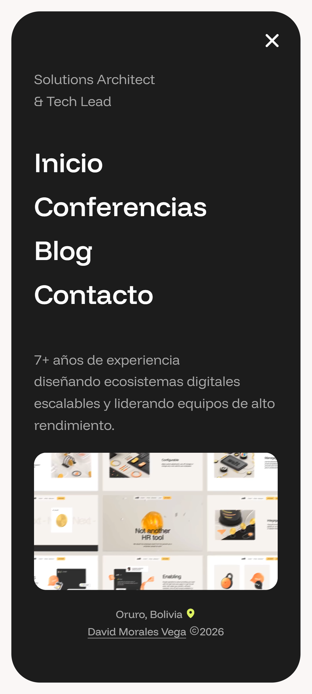
Responsive design
Morales Vega David

David's portfolio could not look like a WordPress theme. Every design decision was tested against one question: does this communicate that we are looking at a top-tier professional? Only what passed that test made the final cut.

Premium Dark, With Purpose

The dark theme is not a trend — it is a statement. It conveys technical precision, professional maturity and the kind of sophistication that enterprise clients and international conference organisers associate with a senior solutions architect.

Animations That Communicate

The GSAP animations are not decorative. Smooth scrolling, per-section reveals and technology marquees create an experience that says: this professional pays attention to detail. How the site is built reinforces what David does.

SEO as Strategy

The portfolio was built with an information architecture designed for search engines. Schema markup, structured metadata, semantic URLs and indexable content mean Google understands exactly who David is and why he should appear when someone searches for a software architect in Bolivia or Latin America.

A Living Platform

The blog system and speaking section were designed so David can update them himself. The portfolio is not a finished product — it is a platform that grows with his career.

Hero
Experience
Stack
Blog
Services

Typography

David's portfolio uses two typefaces with distinct, complementary roles. Clash Display commands presence in headings; Funnel Display carries readability in body text. Together they build the visual voice of a top-tier personal brand.

Clash Display

A geometric display typeface with a character of its own. Used in headings, section titles and the portfolio's main name. Its high-contrast strokes convey technical modernity and the authority a senior profile requires.

Funnel Display

A body typeface with balanced proportions and excellent legibility at small sizes. Used in paragraphs, project descriptions and blog articles — ensuring comfortable reading without competing with Clash Display's presence in the headings.

Colour Palette

David's portfolio operates in two modes, each with its own palette. In dark mode, deep charcoal and electric lime create high-impact contrast. In light mode, warm white and soft lilac convey approachability without losing sophistication.

#161616

Near-black charcoal. The dark mode background. Warmer than pure black — it absorbs light and makes the electric accents leap out with maximum visual intensity.

#DDF160

Electric lime. The action colour in dark mode. It appears in buttons, CTAs and interactive elements — a bold choice that breaks the black with energy without losing legibility.

#FAF7F6

Warm ivory white. The light mode background. It avoids the coldness of pure white, creating an organic, readable base that gives visual breathing room between dense sections.

#9F8BE7

Mid lilac. The action colour in light mode. Against the warm ivory it gives enough contrast without aggression — conveying technical creativity and setting David's profile apart from generic corporate portfolios.

Site Structure

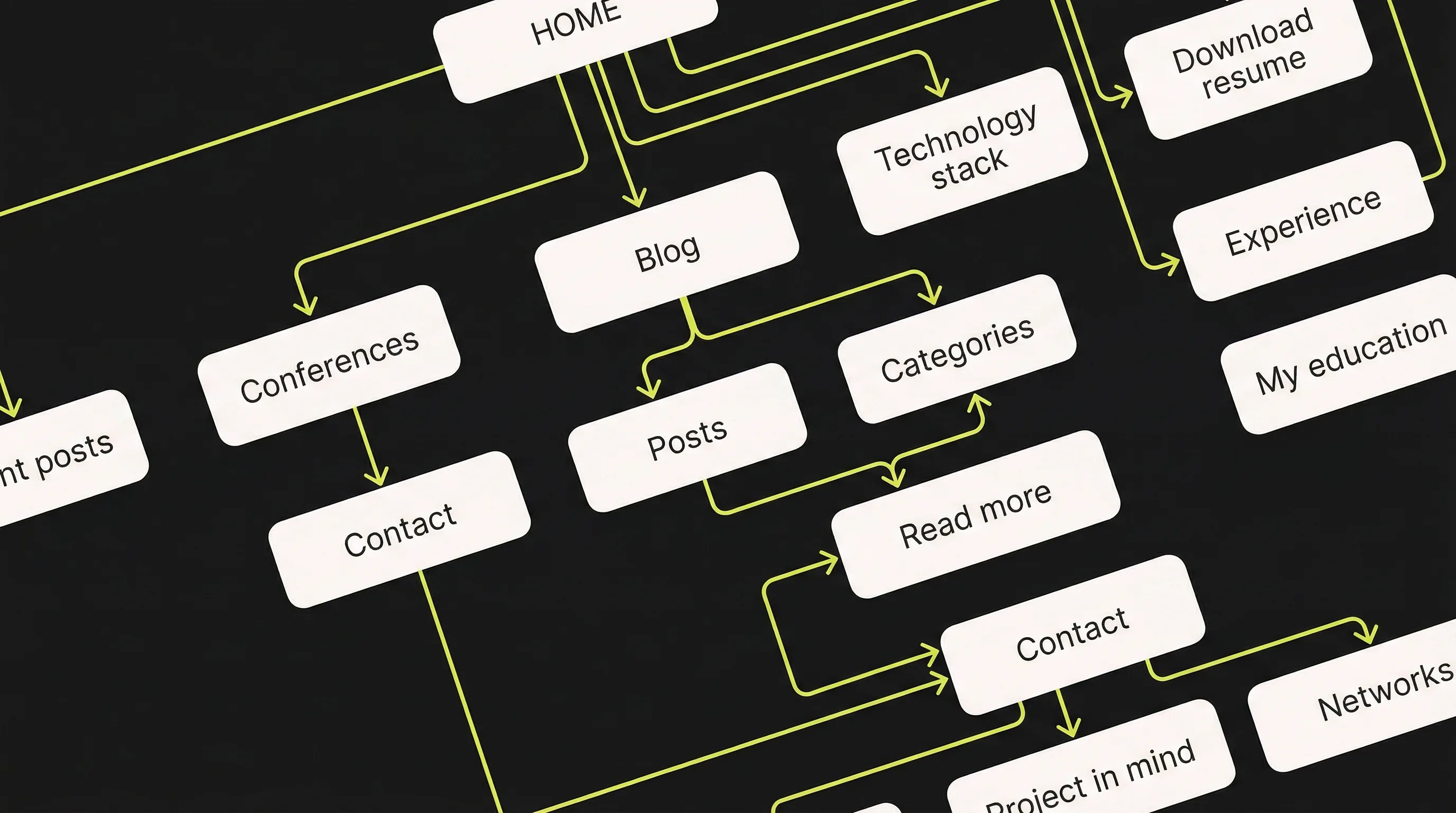
The site is organised in three layers. The first introduces David and builds immediate trust. The second demonstrates authority through talks, experience and the blog. The third converts: services, consulting and contact. The flow takes the visitor from getting to know him to hiring him.

Conclusion

moralesvegadavid.com is not just another portfolio — it is a positioning platform working around the clock. When someone searches for David on Google, they find a site that communicates exactly who he is, what he knows and why he should be the first call. The premium design, thorough SEO and updatable content make this a long-term investment in a top-tier personal brand.

Let's build something great together

Let's collaborate!