Project

PhysioLife

Sector Healthcare / Physiotherapy
Client PhysioLife Rehabilitation Centre
Location Oruro, Bolivia
Year 2025
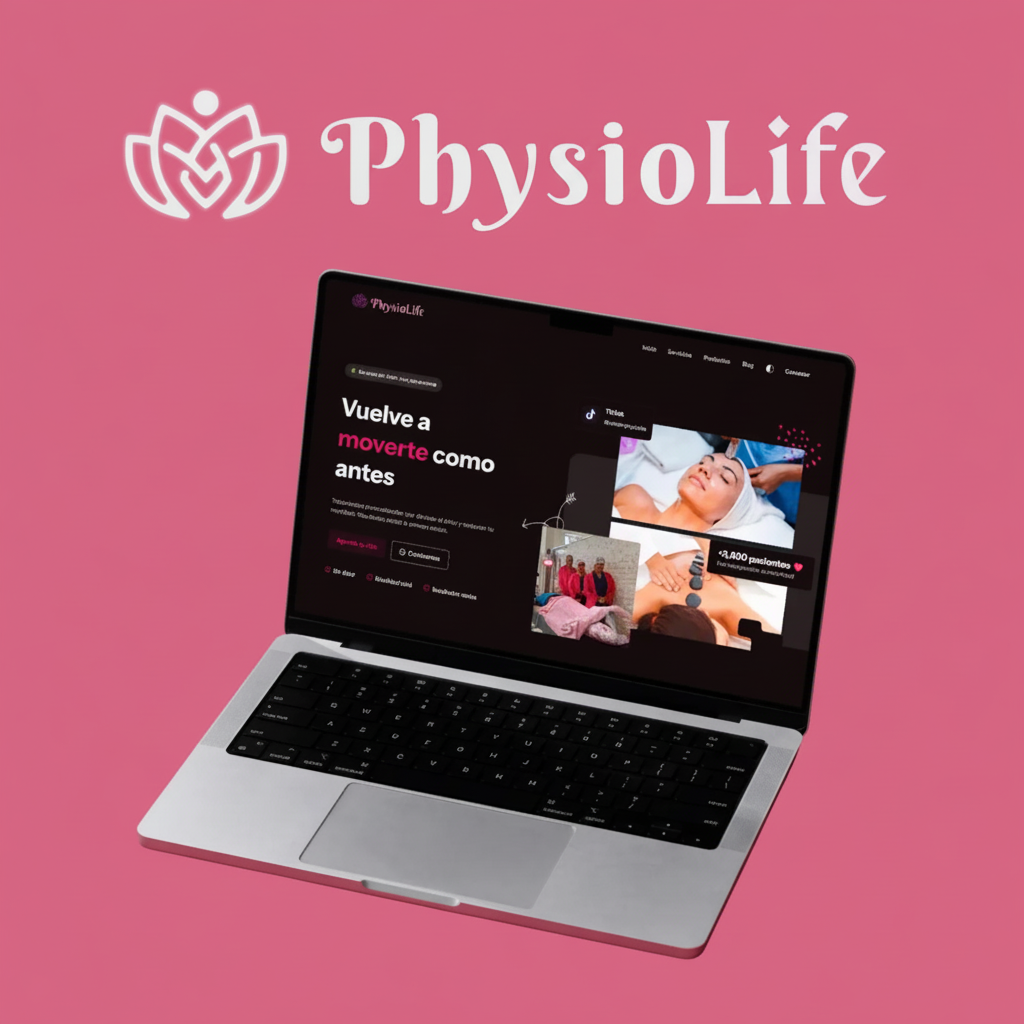
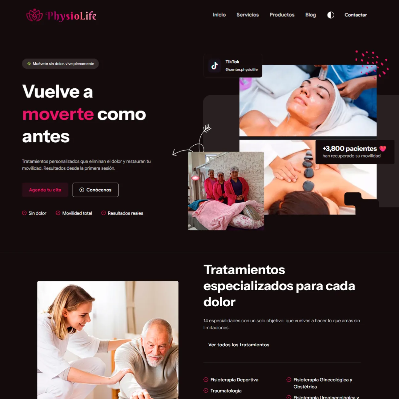
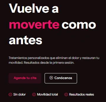
PhysioLife website - Hero section in light and dark mode

Client and Idea

From nothing to a complete digital presence

When the PhysioLife team got in touch they had something valuable: dedicated professionals and a space ready to receive patients. What they lacked was everything else — logo, colours, website, social media. We literally started from a blank page to build a complete brand conveying the warmth and professionalism already present inside the centre, and took it into the digital world so patients could find them and trust them before walking through the door.

The Challenge

In healthcare, trust is everything. A patient will not book if the brand does not feel reassuring. PhysioLife was competing against established centres with years of reputation, without a single digital asset of its own. The challenge was building that authority from scratch, quickly, and with visual coherence across every touchpoint.

What We Built

  • Brand created from scratch: logo, colours, typography and tone of voice
  • A professional website with WhatsApp appointment booking
  • An active presence on 6 social networks with a content strategy
  • An interactive gallery showing the facilities and equipment
  • Local SEO to rank for "physiotherapy in Oruro"
  • Light and dark mode for comfortable browsing
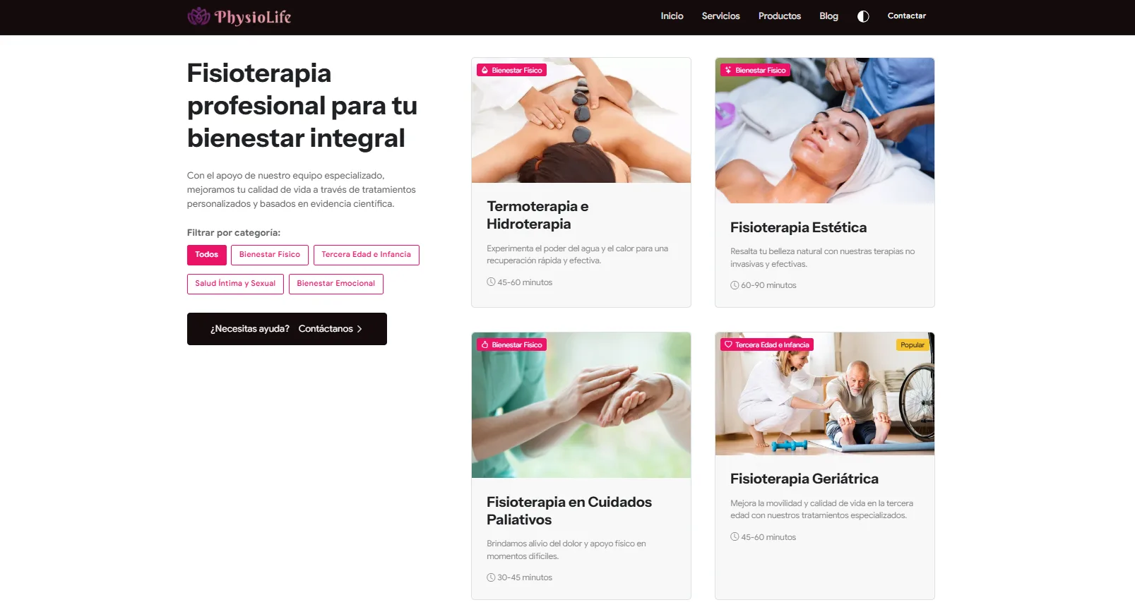
  • A complete catalogue of 14 specialist services
  • A digital marketing strategy to attract the first patients

14

Services
Specialised

6

Social Media
Active

340 h

Development and Design

300 h

Testing

+ 200

Daily Visitors

Application features

Every feature was designed to reduce the friction between a patient and their first appointment. Nothing was built for looks; everything has a clear purpose in the conversion flow.

WhatsApp Appointment Booking

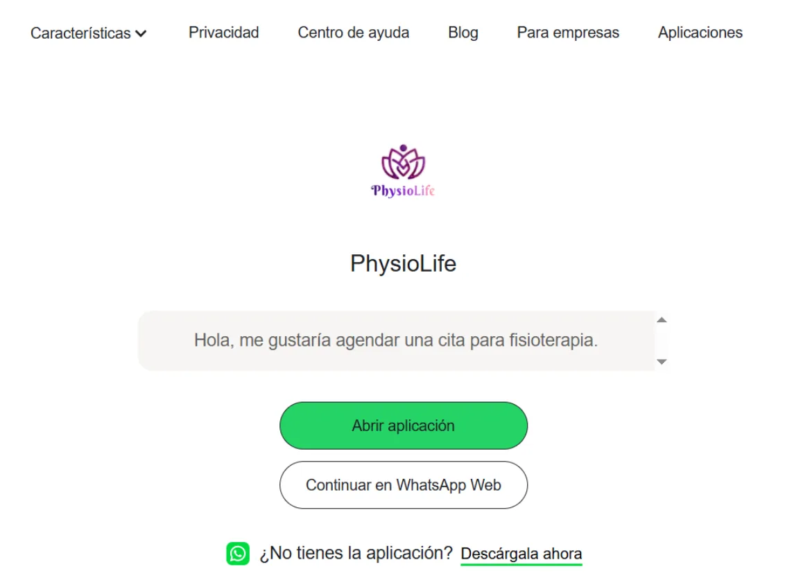
Patients can book without leaving the page. A direct button opens WhatsApp with a pre-filled message including the service they are interested in — cutting time-to-contact to under 30 seconds.

That decision removed the barrier of traditional forms and matched how people in Bolivia actually behave, where WhatsApp is the main communication channel.

A Catalogue of 14 Services

Each service has its own page with a description, benefits and a call to action. Patients understand exactly what is on offer before calling — building trust and producing better-qualified enquiries.

The structure was also built for local SEO, with Oruro-specific search terms woven naturally into each service page.

Product Catalogue

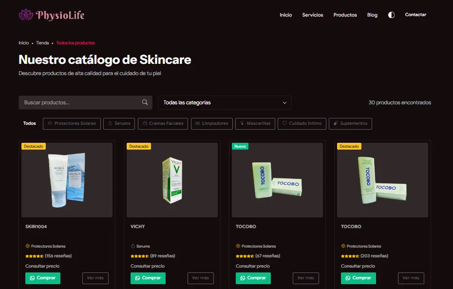
Each product has a detailed listing, images and a direct enquiry option. An extra layer of value positioning the centre beyond rehabilitation services alone.

The structure was also built for local SEO, with Oruro-specific search terms woven naturally into each product page.

UX/UI Design

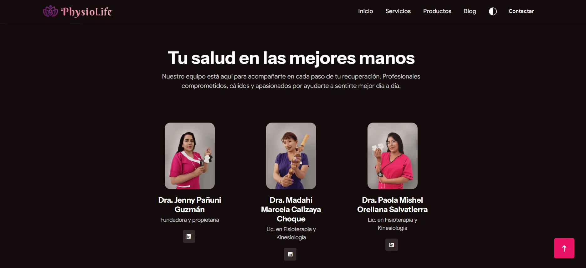
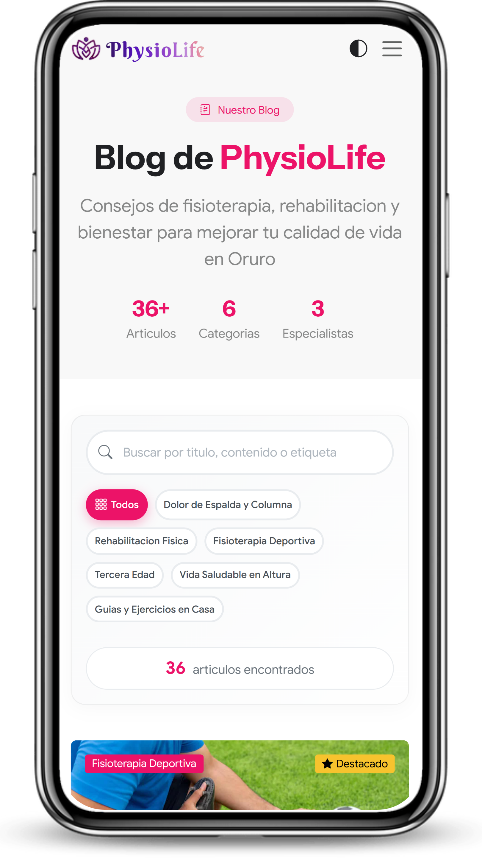
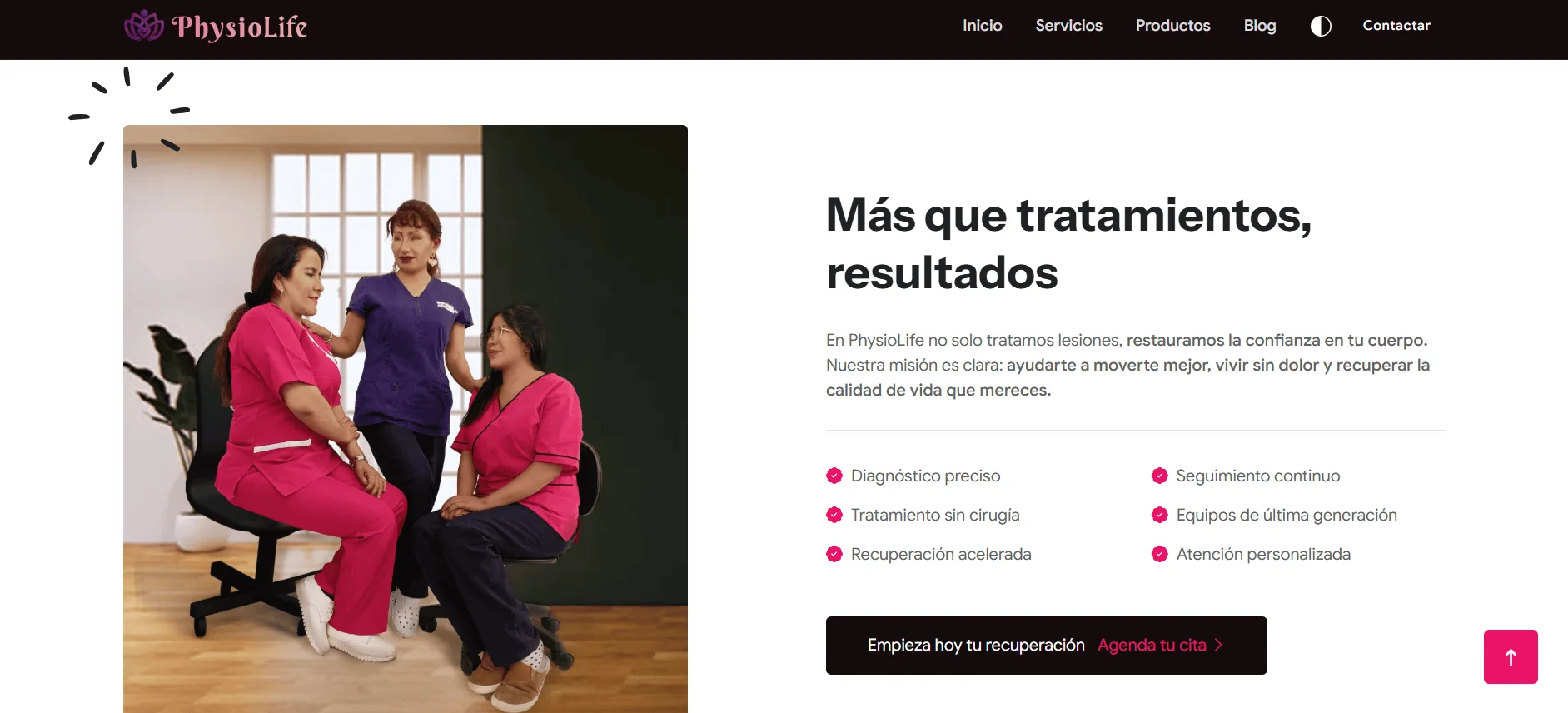
PhysioLife - Light mode
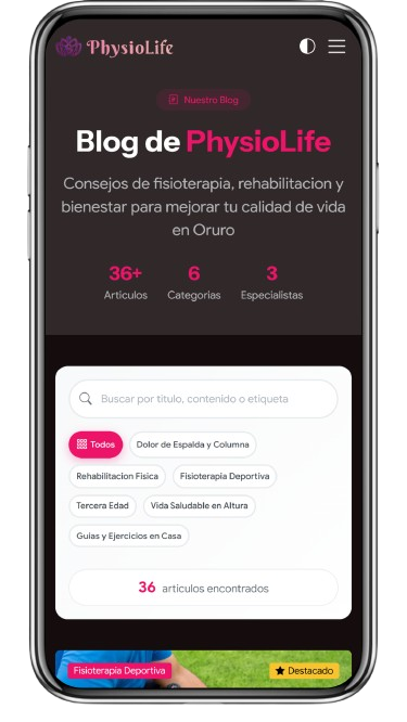
PhysioLife - Dark mode

The design was not decorative — it was strategic. Every visual decision was guided by one question: does this build trust or erode it? In healthcare that distinction changes everything.

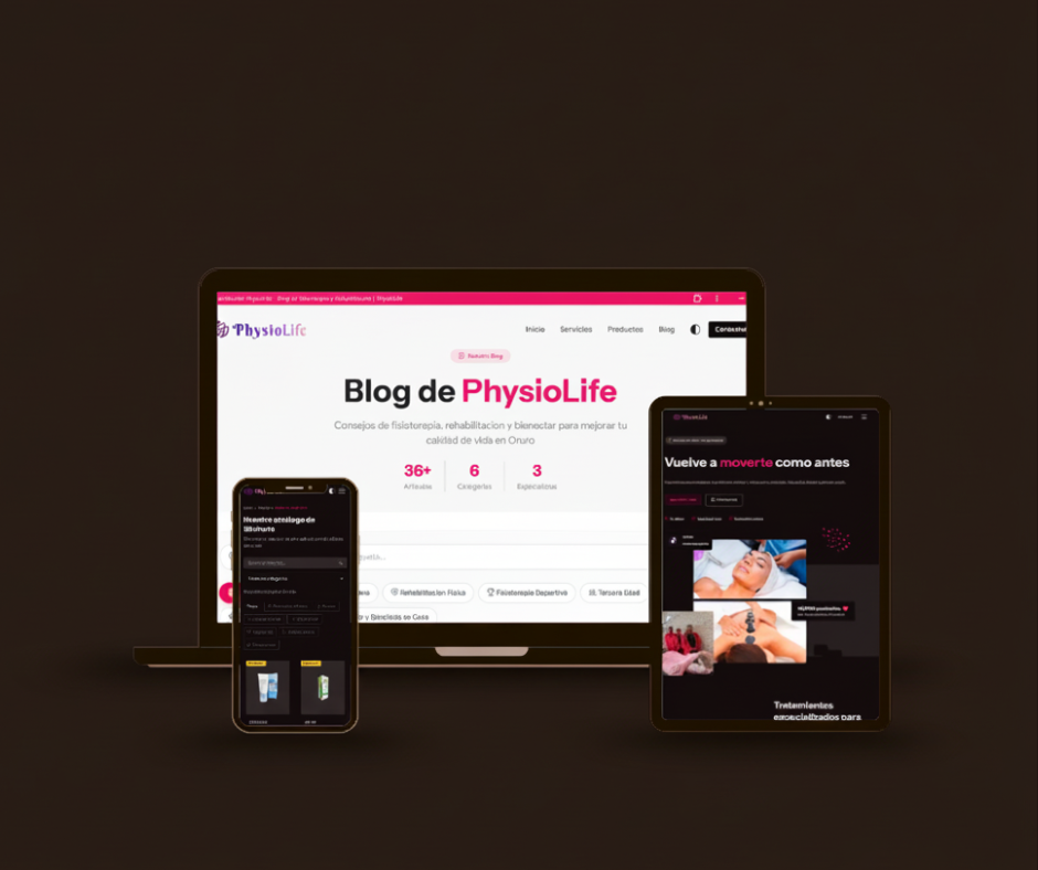
Mobile-First Design

More than 75% of users arrive on a phone. The site was designed for mobile first and adapted to desktop afterwards — not the other way round. That means reachable buttons, legible type and load times optimised for mobile networks.

Clear Visual Hierarchy

The visual journey was designed to guide the user from first impression to action: a clear value proposition, services that scan quickly, and visible CTAs in every critical section without cluttering the interface.

Consistent Identity

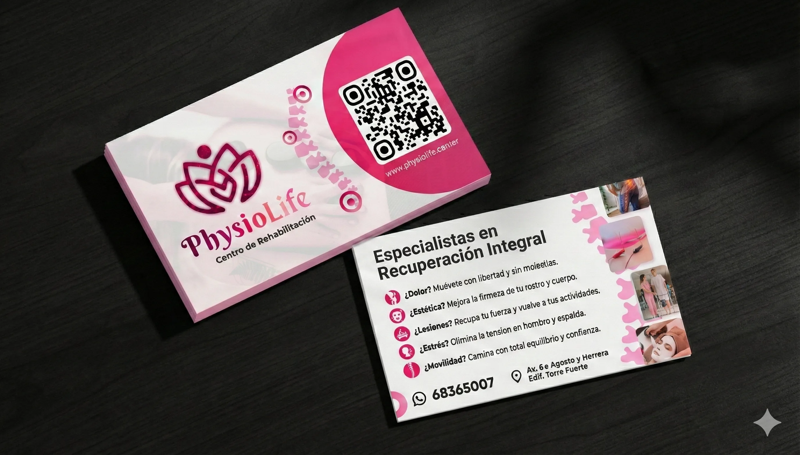
The design system built for the website extended to social media, print material and digital communications. The brand looks the same at every touchpoint, building recognition and trust over time.

Accessibility and Contrast

Colours, type sizes and spacing were checked against accessibility standards. A health centre must be accessible to everyone, including users with low vision or reading in difficult conditions.

preview
preview
preview
preview

Typography

Typography is not just aesthetics — it is voice. The typeface chosen for PhysioLife conveys medical authority and human warmth at the same time, working at every size and on every medium.

Instrument Sans

Designed by Google with generous proportions and open strokes, Instrument Sans balances technical precision with human warmth. Its clear forms and generous spacing make it ideal for a health centre: professional without being cold, approachable without losing authority.

Colour Palette

Every colour was chosen deliberately. PhysioLife's colour system balances clinical seriousness with human warmth — conveying professionalism without losing the approachability a rehabilitation centre needs.

#140C0D

Deep black. The brand's primary background. It conveys elegance, authority and focus — the base everything else breathes against.

#C91058

Intense pink. The primary accent. It evokes energy, health and movement — the colour that directs attention to what matters.

#312829

Dark brown. The mid tone that adds depth and warmth without breaking the system's restraint.

#FFFFFF

White. Purity and clarity. Used in type and breathing space to balance the intensity of the rest of the palette.

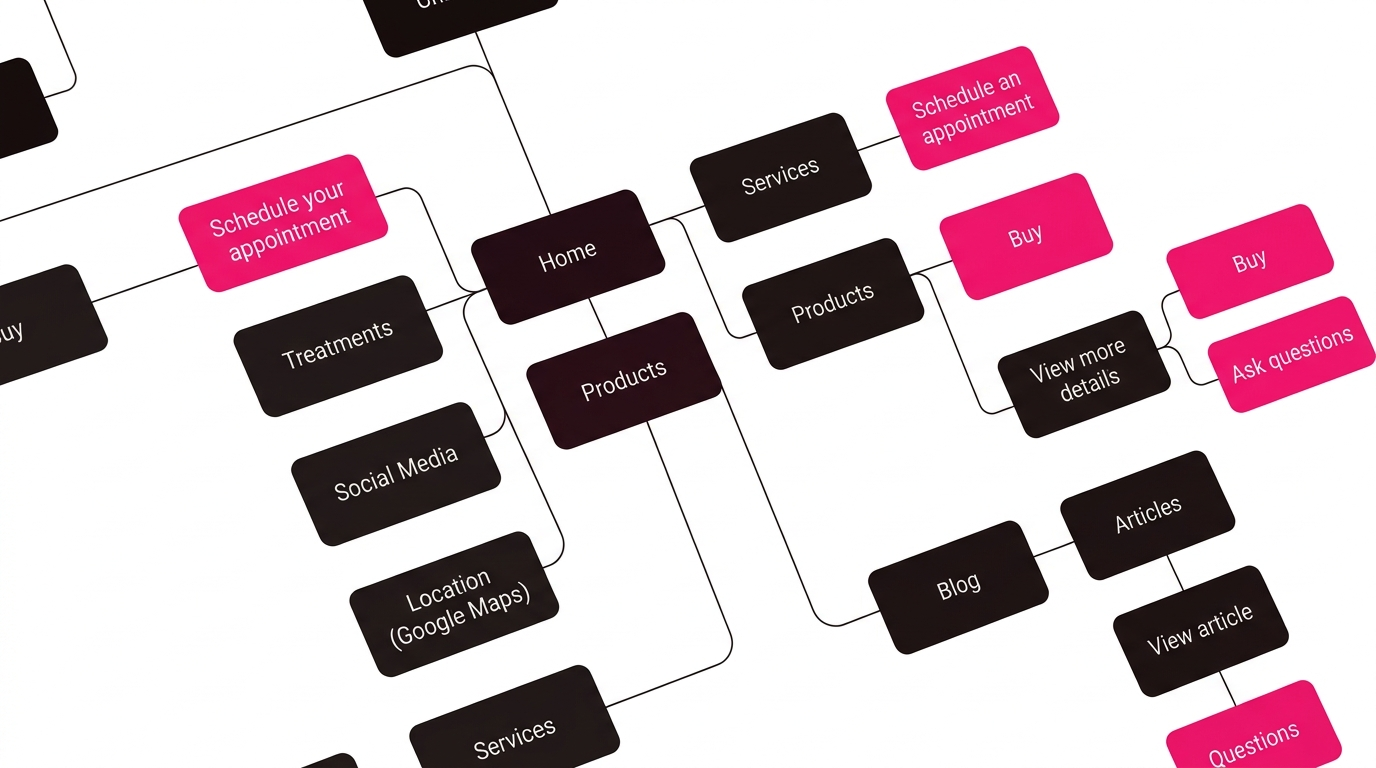
Sitemap

The site structure was designed so patients find what they are looking for in as few clicks as possible. Each section answers a question users ask themselves before booking an appointment.

Conclusion

PhysioLife went from having no digital existence to a complete professional presence. This project shows that a well-executed digital strategy can transform a healthcare business from the first month.

Let's build something great together

Let's collaborate!