
15 / 25Social Impact
Vive Sin Miedo
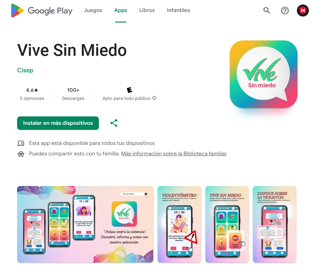
Visit the siteWhen technology has a purpose that genuinely matters
Highlights
- 01An app against gender-based violence
- 02Panic button and help map
- 034.6 stars on Google Play
The project
Bolivia has one of the highest rates of gender-based violence in Latin America. CISEP, backed by Manos Unidas (Spain) and the French Embassy, needed a digital tool that reached the hands of those who need it most: women in vulnerable situations, many of them in mining areas with limited connectivity.
The Challenge
The users of this app are not technical people. They are women who may be in crisis, in rural mining areas with barely any mobile signal. Every button, every screen, every word had to be thought through for that context. The app had to be extremely simple, work without internet, and make sure that in a real emergency help is one tap away.
What We Built
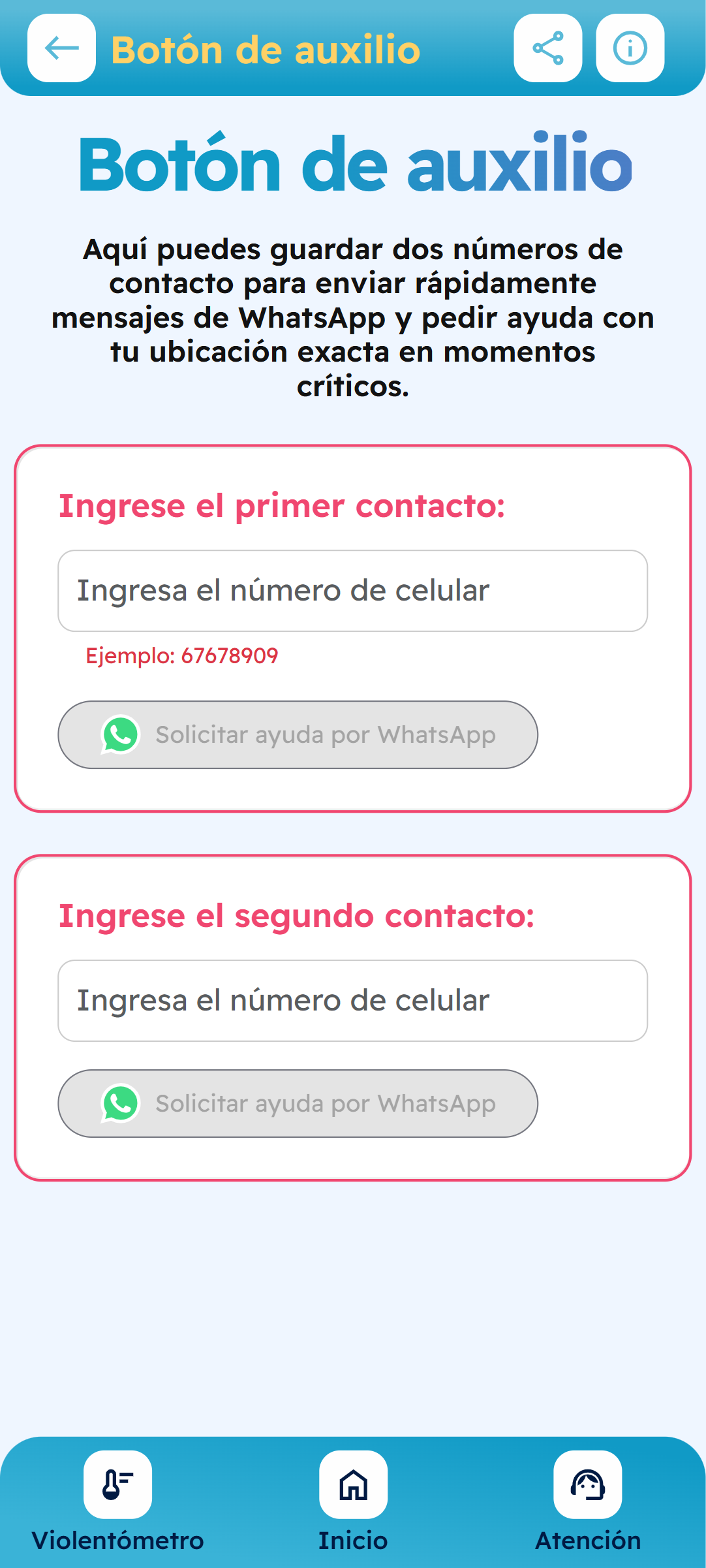
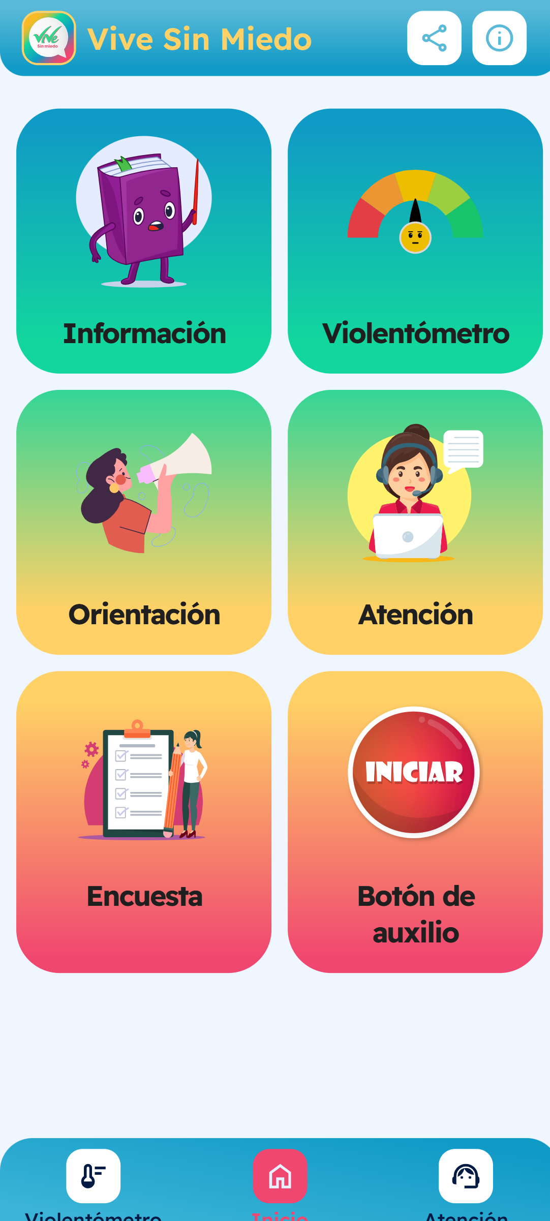
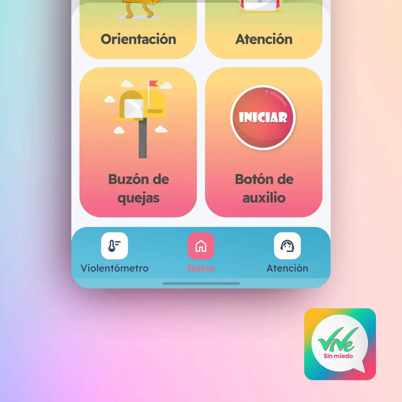
- A panic button for genuine emergencies
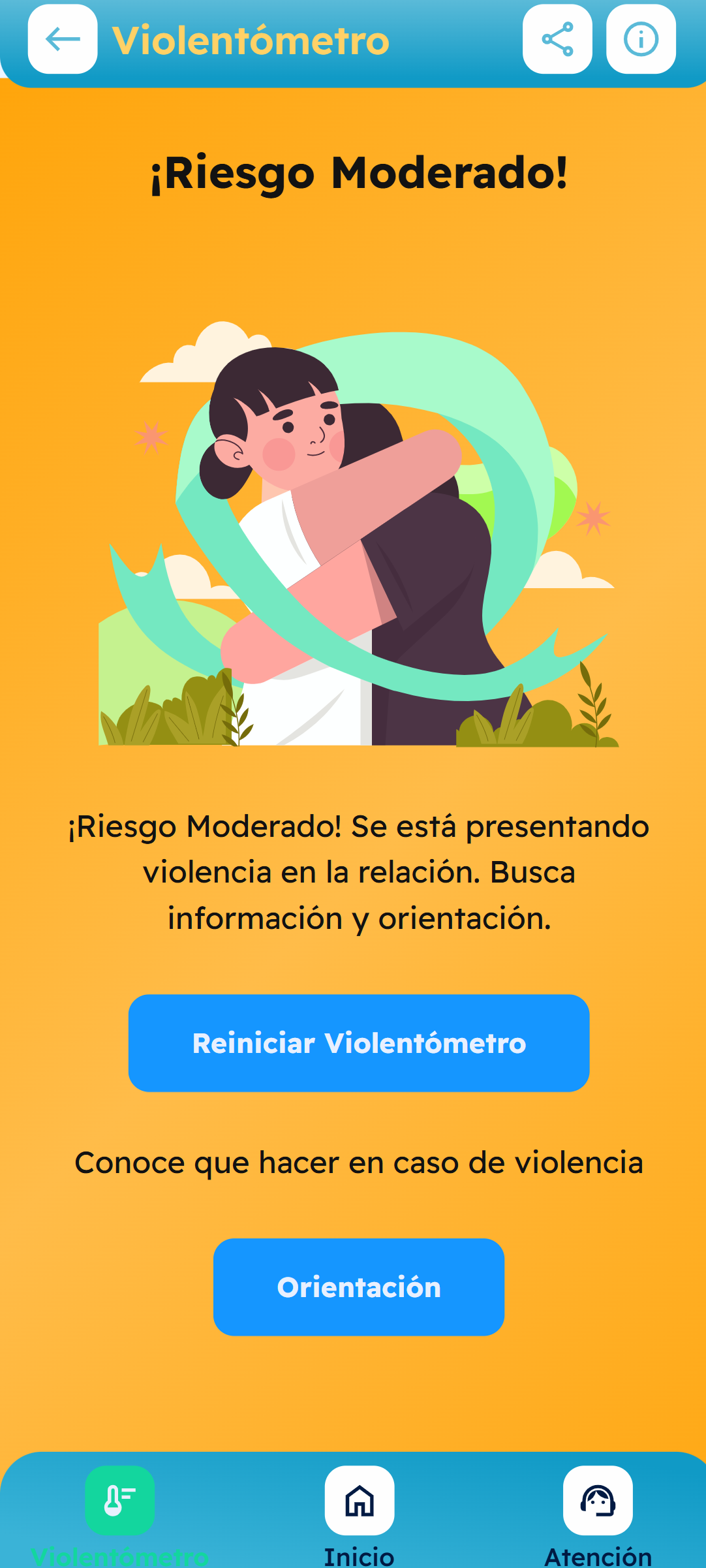
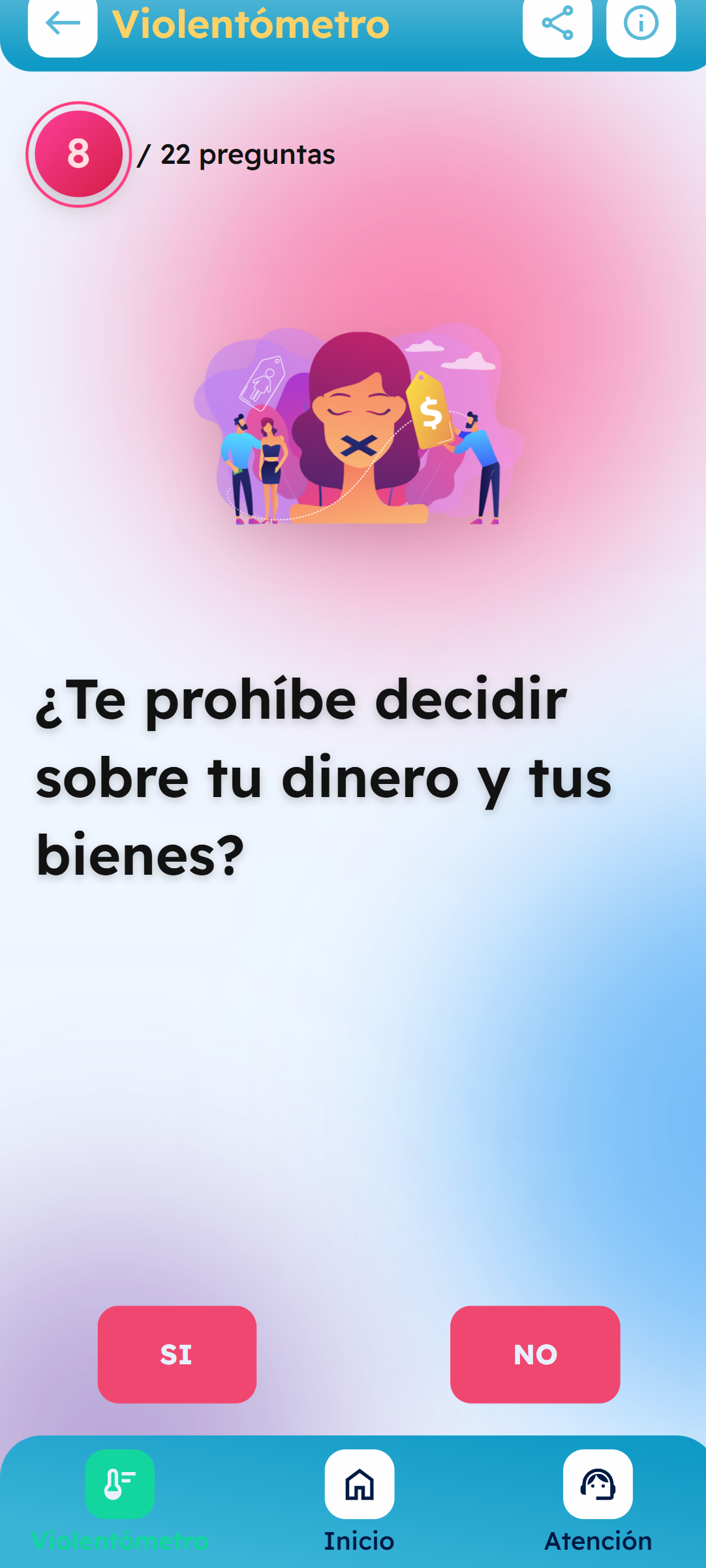
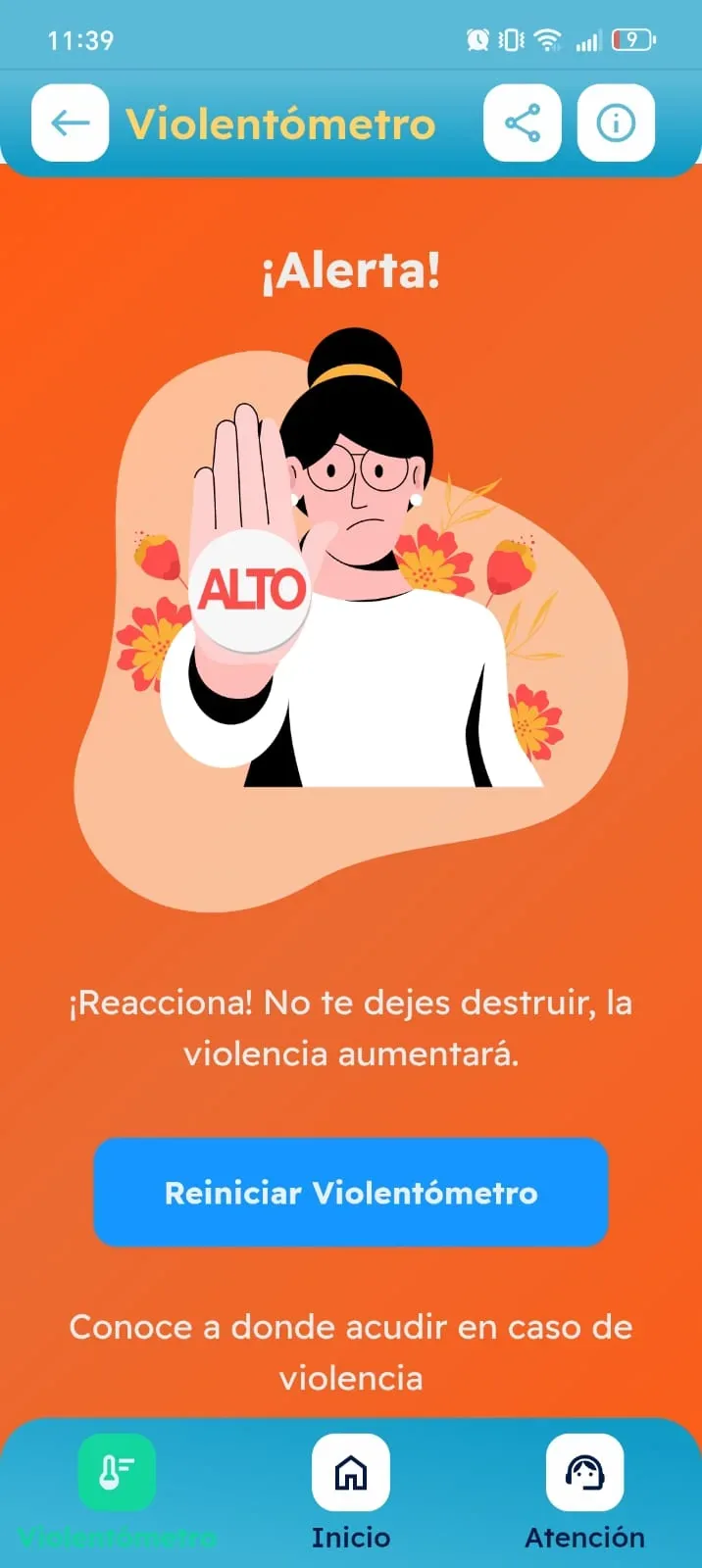
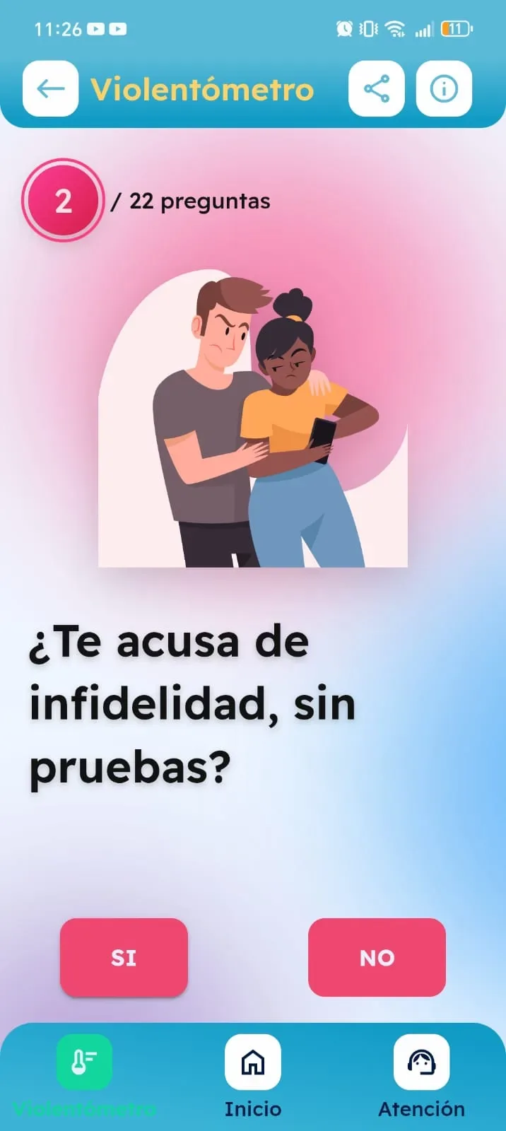
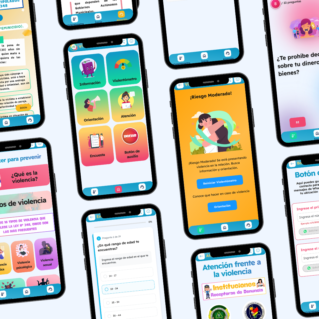
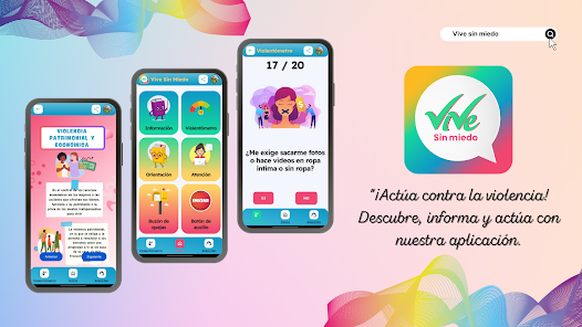
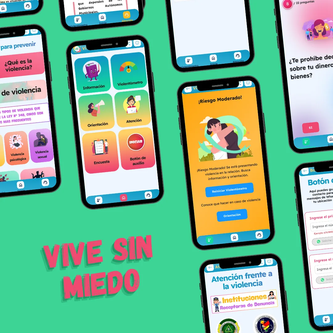
- Violence meter: assessing the level of violence in a relationship
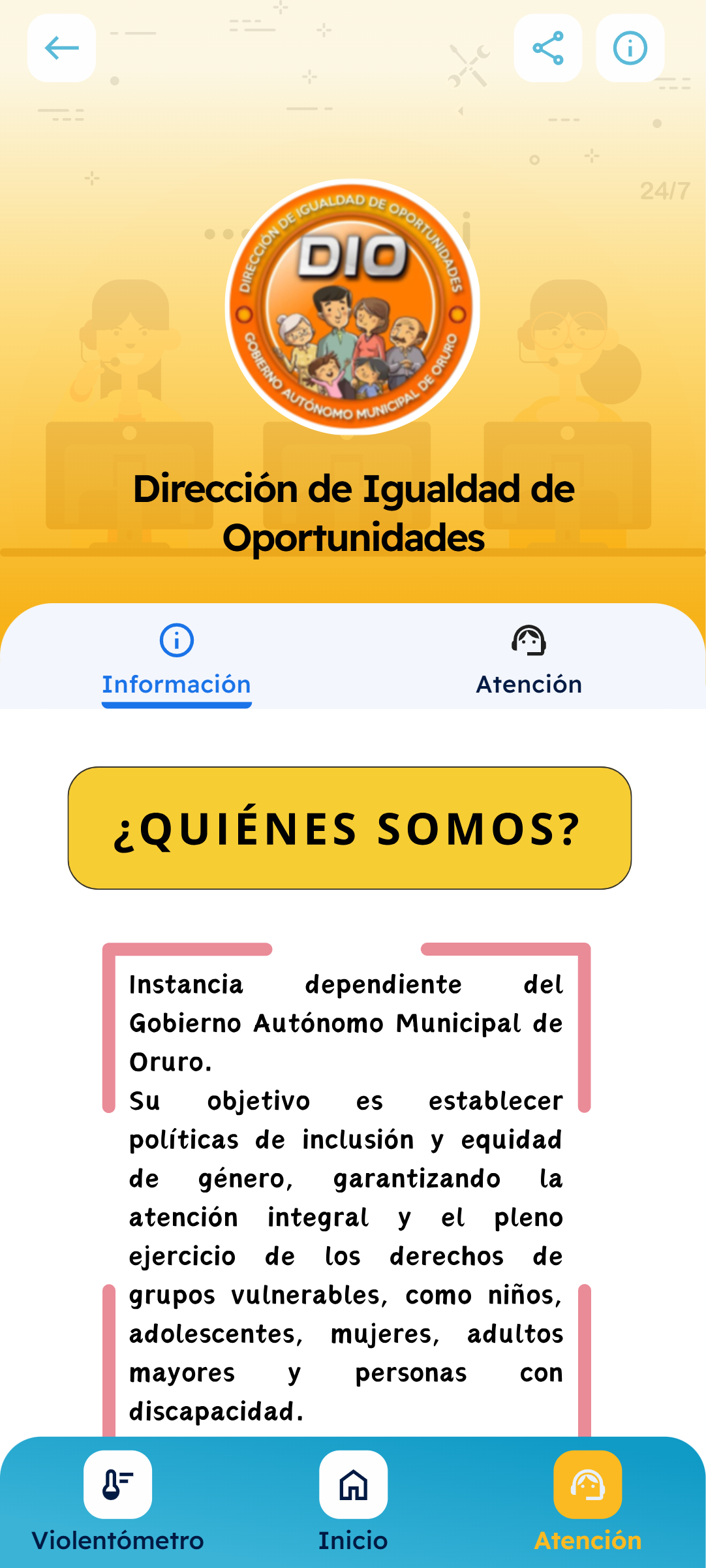
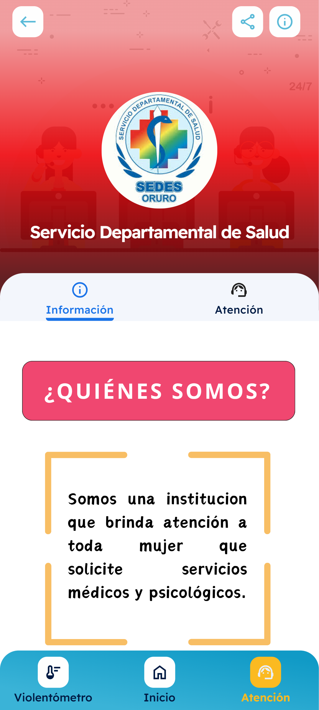
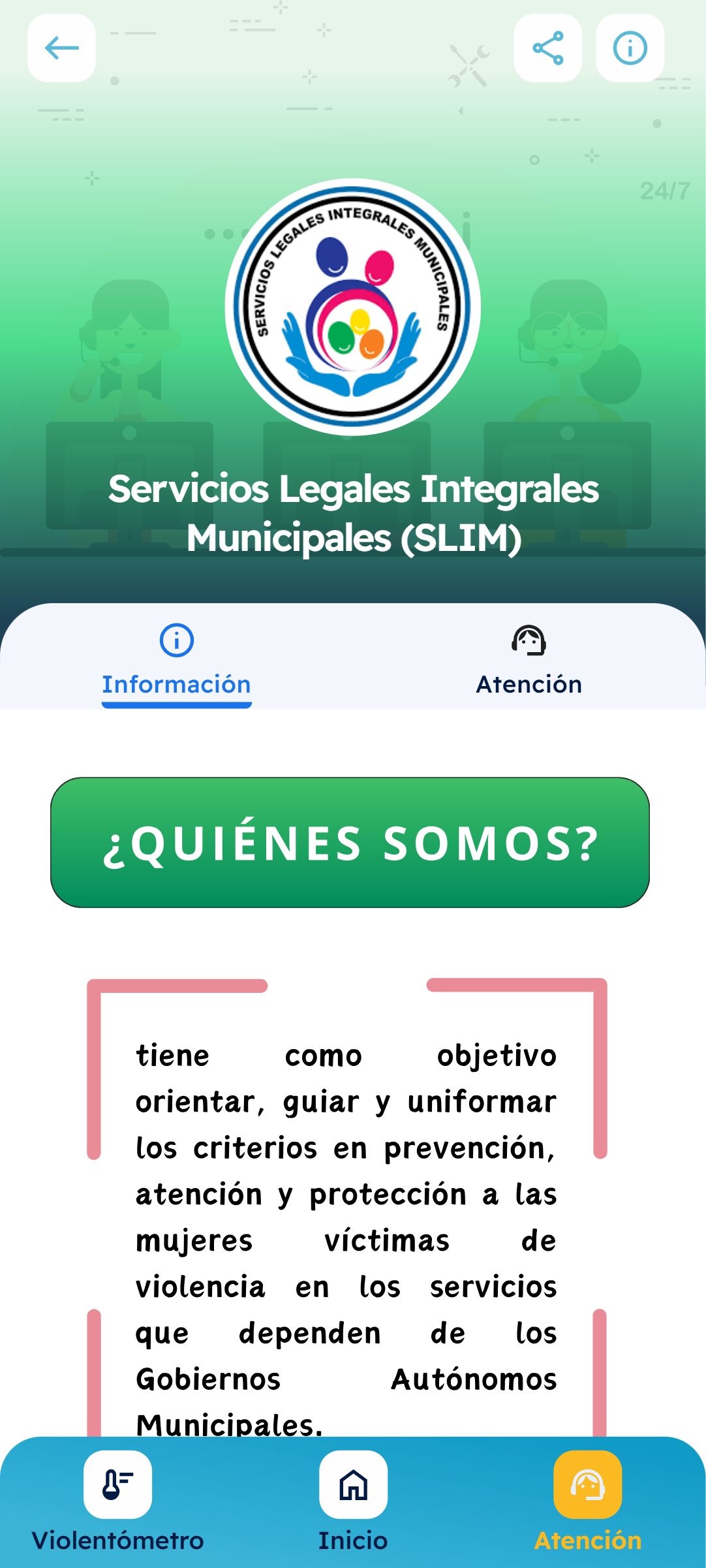
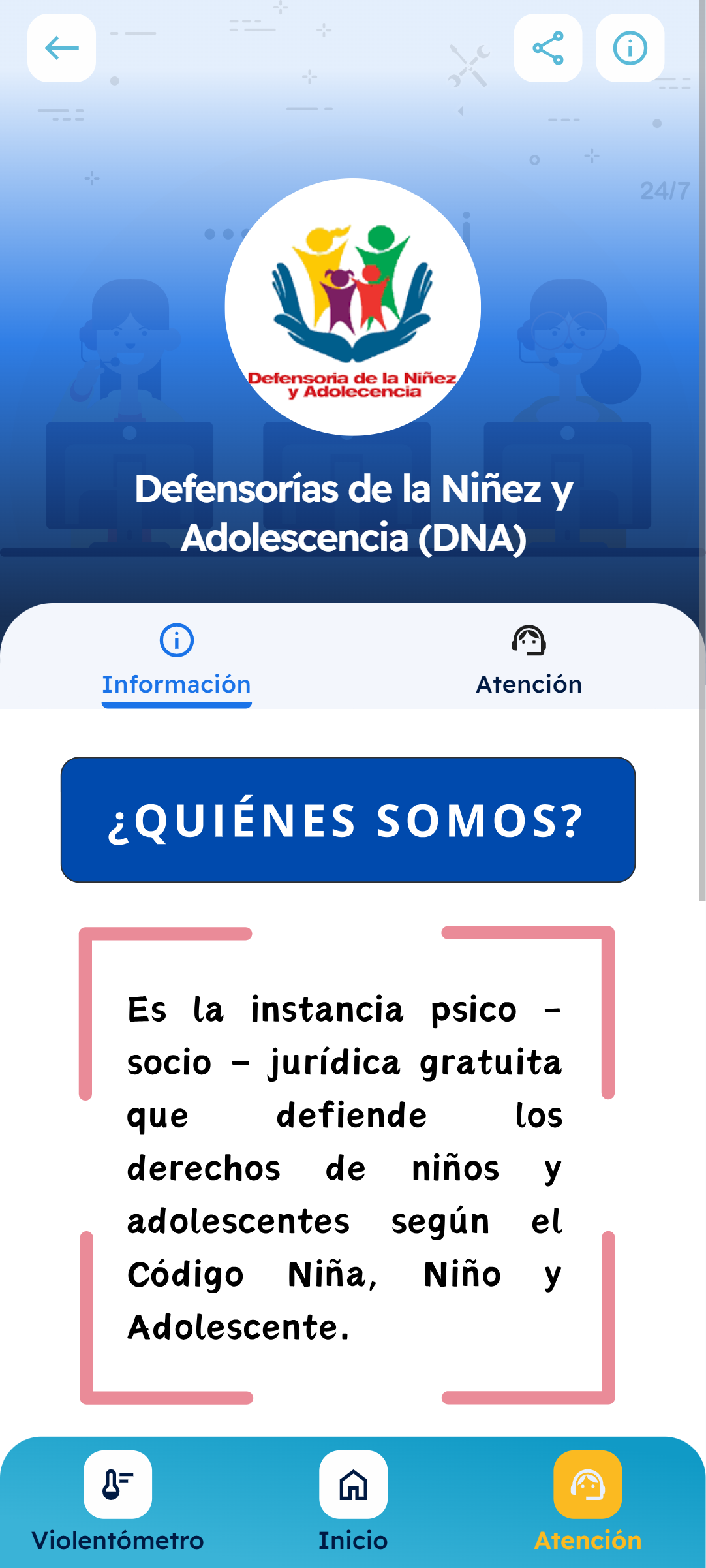
- A map of nearby institutions where help is available
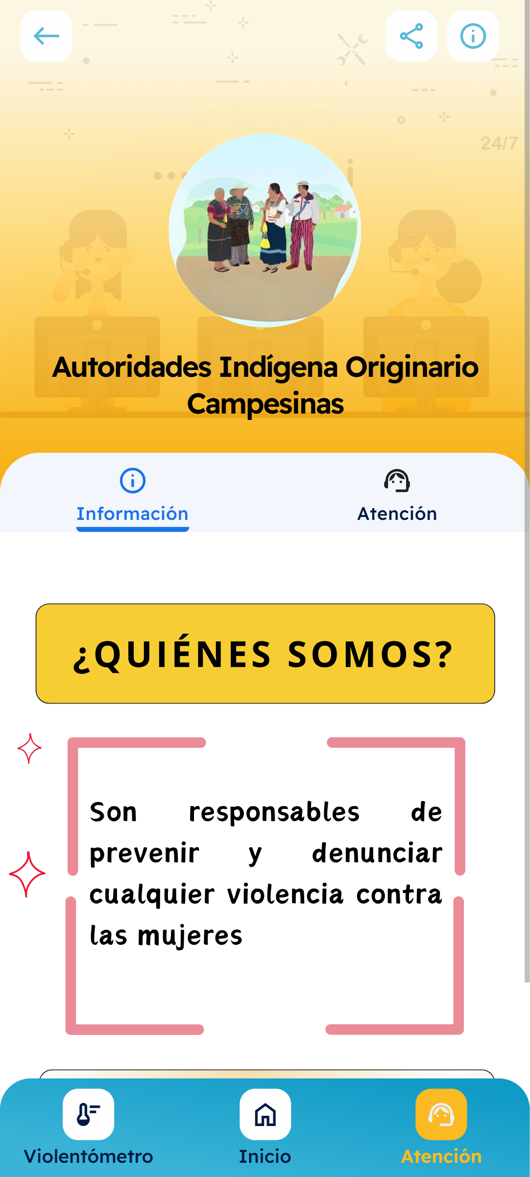
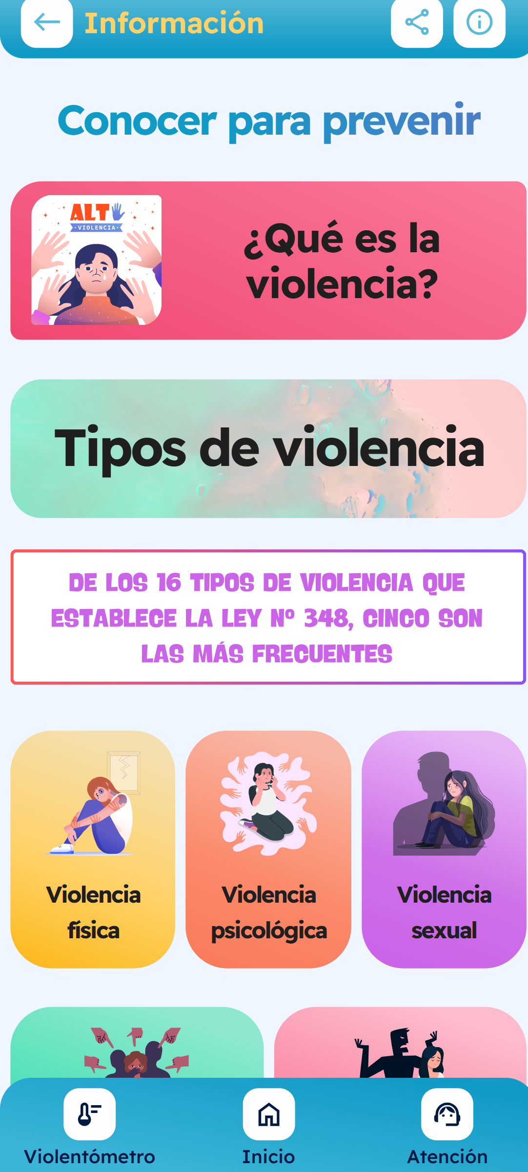
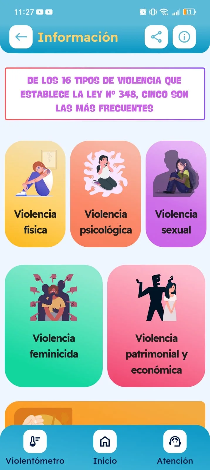
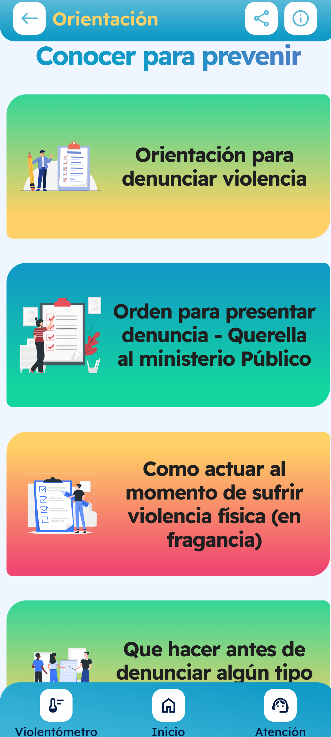
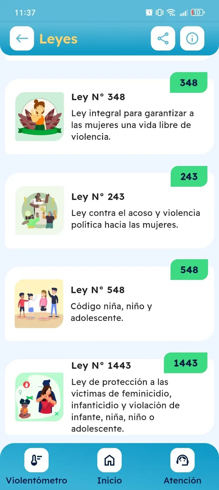
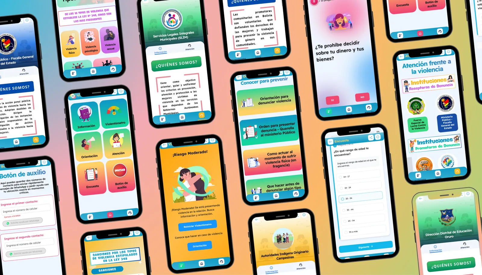
- Information on rights and the reporting process under Law 348
- Works without internet in areas with limited connectivity
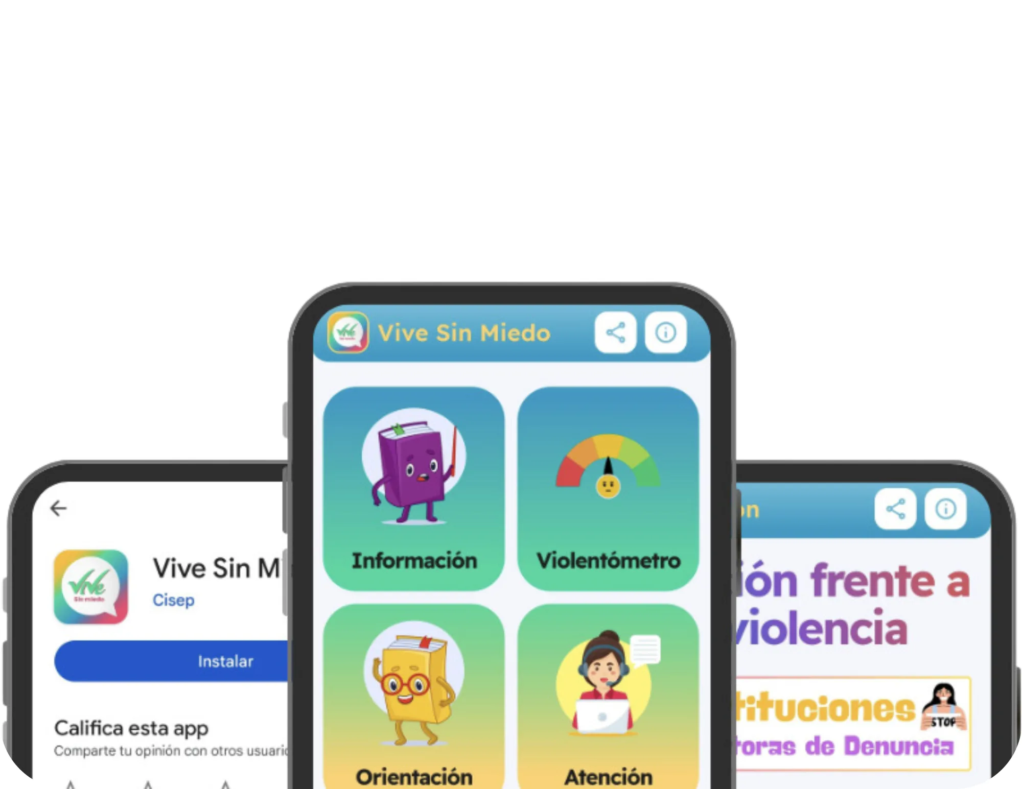
- Available on Google Play and as an installable app (PWA)
- Specialised surveys for women in the mining sector
- Accessible design for people with low digital literacy
Project overview
App features
Every feature was designed for an extreme context: a woman in crisis, with poor signal, who needs help in seconds. There is no room for friction or a learning curve.
Panic Button
In a real emergency, every second counts. The panic button is designed to reach someone quickly when in danger — no menus, no intermediate steps. One tap triggers the help protocol.
Geolocation identifies where the user is so she can be connected with the nearest institutions in real time.
Digital Violence Meter
Many women do not recognise that what they are living through is violence. The violence meter is a self-assessment tool that guides the user through simple questions to understand the level of risk in her situation.
Based on validated methodology, adapted to the Bolivian cultural context and to the mining sector specifically.
Institution Map and Reporting
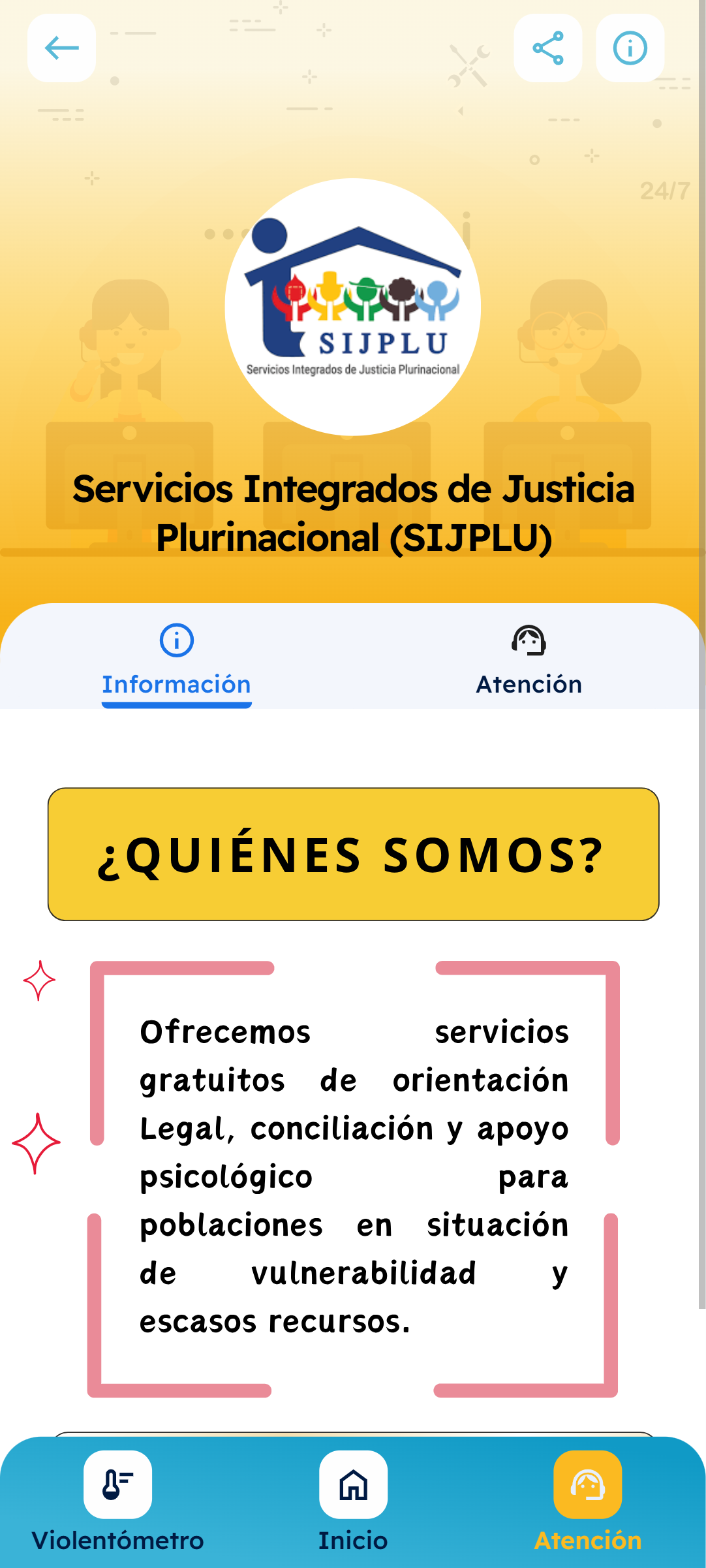
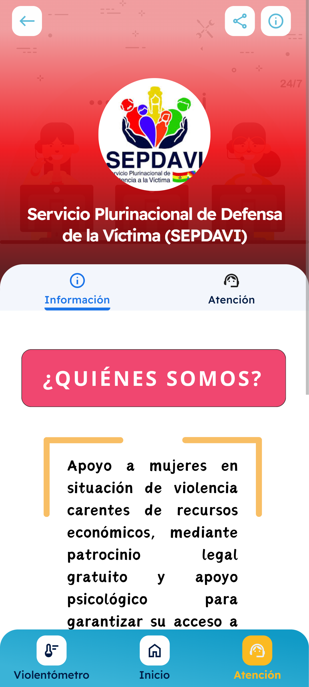
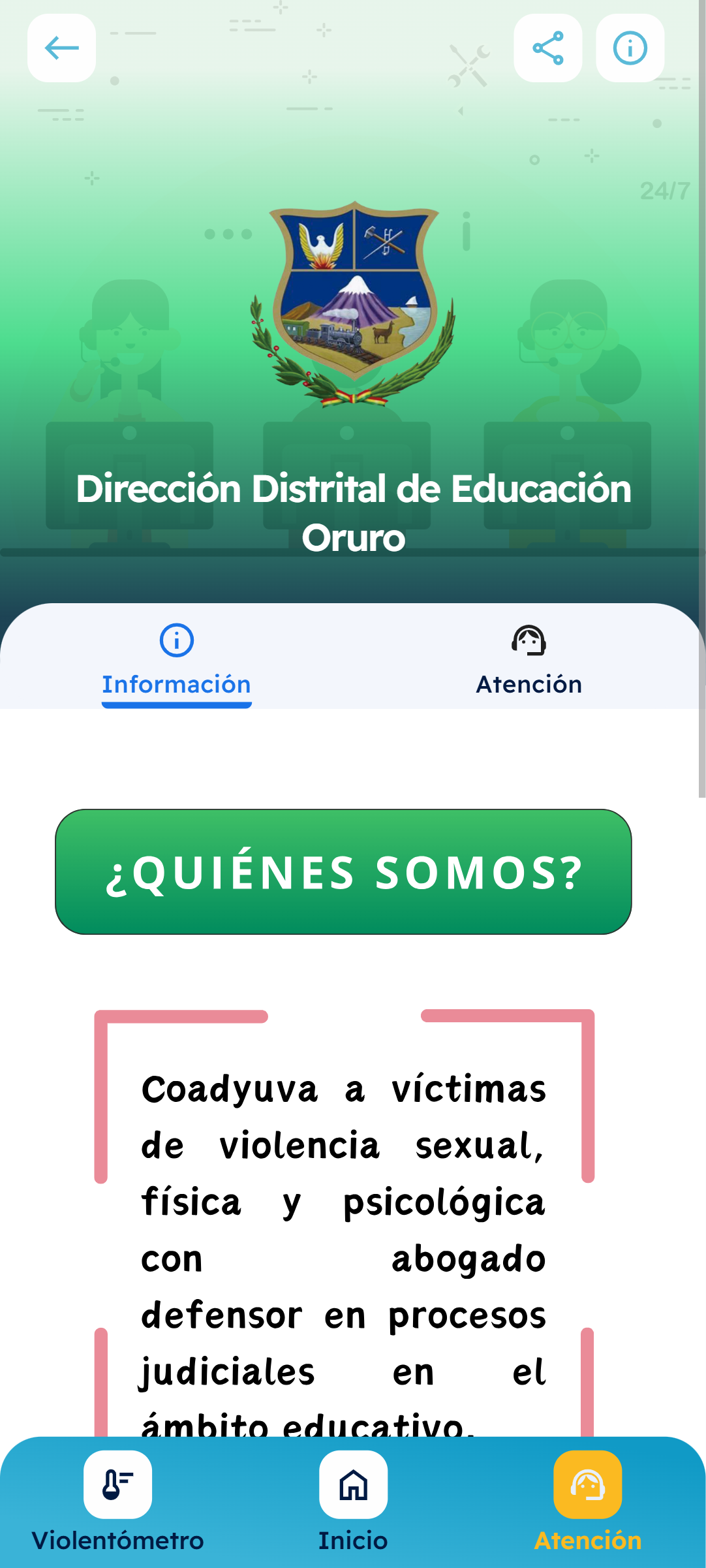
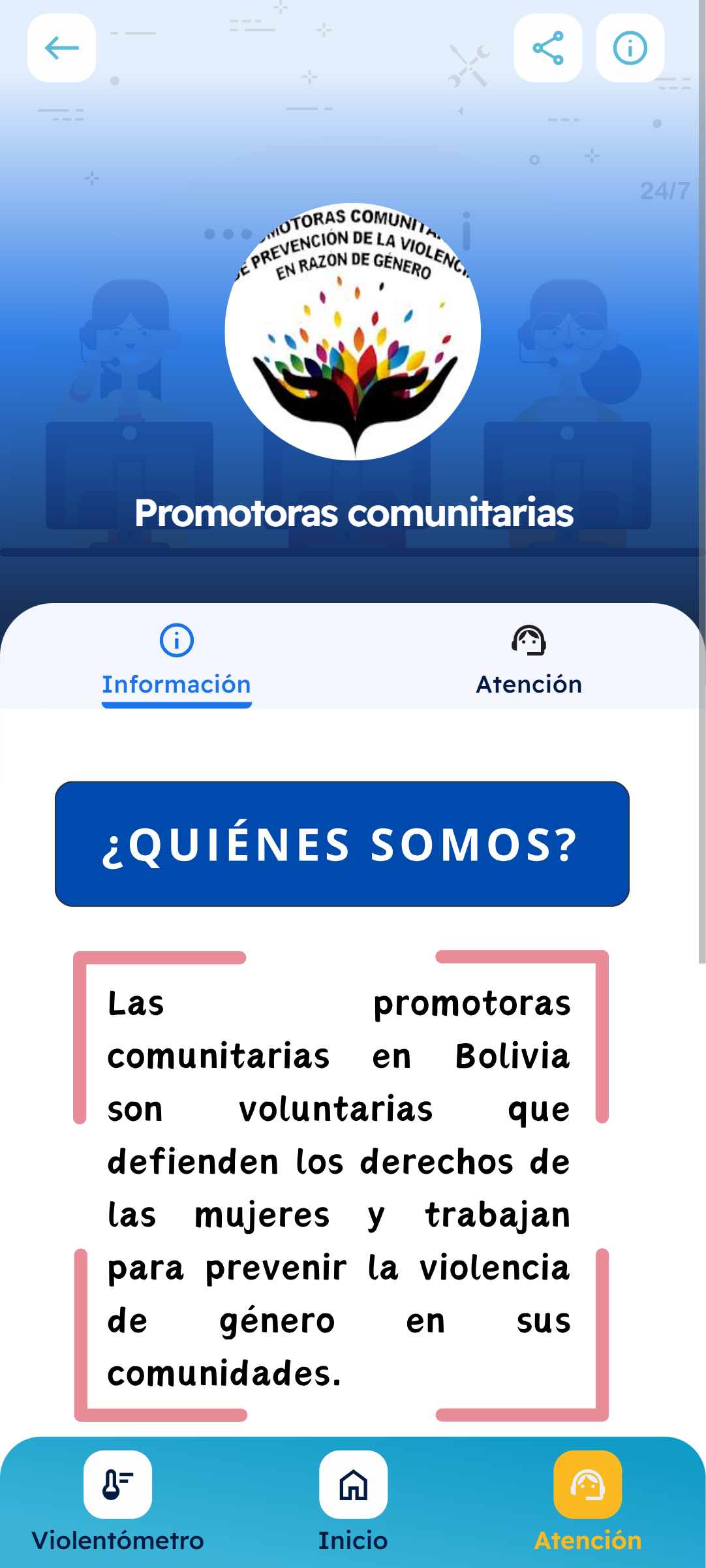
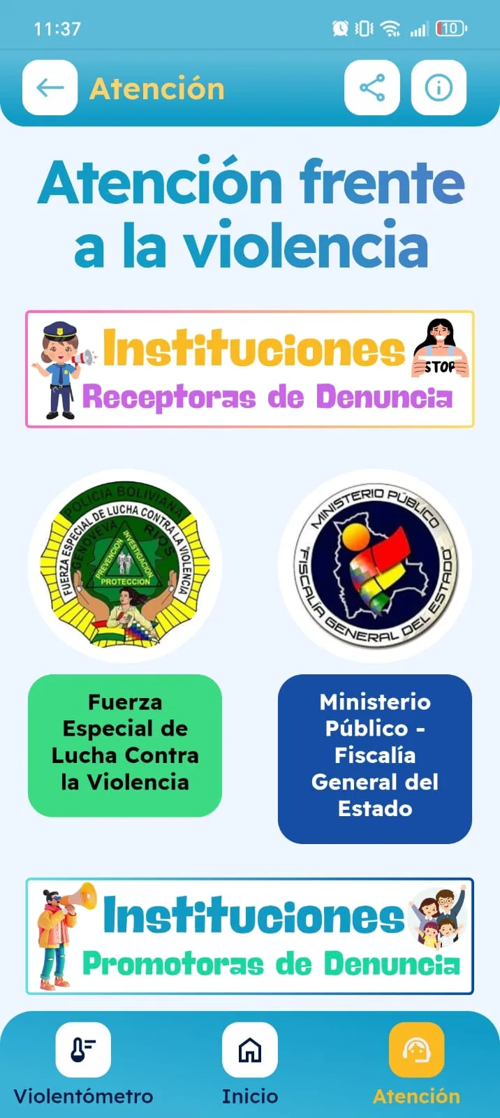
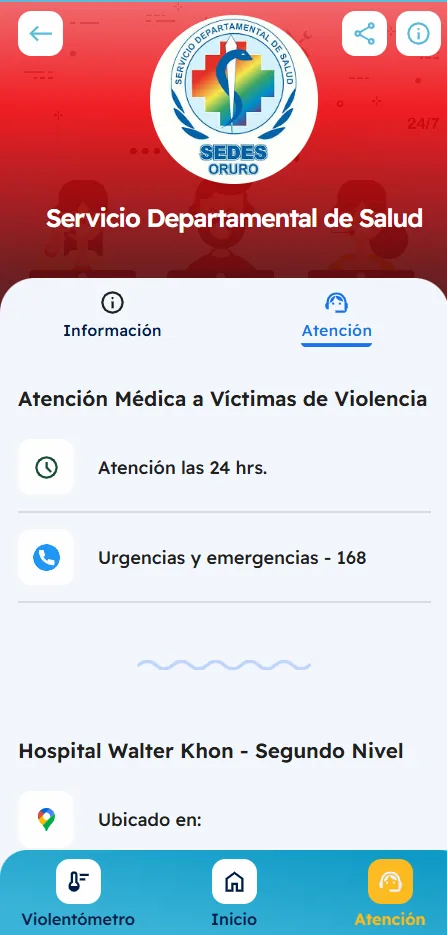
The app shows a map of every institution where a woman can get help: prosecutors' offices, municipal women's services (SLIM), shelters, hospitals and more. Filtered by type and ordered by distance.
It also includes step-by-step guides on how to report under Law 348 and which documents are needed.
Design Process
UX/UI Design
Vive Sin Miedo's design could not afford to be confusing. The context of use is extreme — a frightened woman, low on battery, somewhere without signal. Every design decision was weighed with that picture in mind.
Extreme Accessibility
Large buttons, text legible without glasses, universal icons and simple language. The app was designed to work in shaking hands, on screens in direct sunlight, on low-end devices.
Trust From the First Tap
The colours, tone of voice and visual structure convey calm and safety from the first screen. A user arriving frightened needs to feel the app understands her and that there is real help on the other side.
Offline First
Mining areas around Oruro have very limited connectivity. The app was designed from the start to work without internet: the informational content, the violence meter and the institution data all load locally once installed.
Cultural Context
The design and content were adapted to the Bolivian context and specifically to the mining sector. The language, the examples and the institutions referenced are all local — not a translation from somewhere else.
Visual Identity
Typography
Vive Sin Miedo's typography prioritises absolute legibility. Under stress and in low light, every character has to read effortlessly — the typeface is a tool of accessibility as much as identity.
Readex Pro
Aa
Designed for universal legibility, Readex Pro supports Latin and Arabic scripts with the same optical quality. Its open forms and generous proportions make it exceptional on small screens and in poor lighting — exactly the environment where Vive Sin Miedo has to work without failing.
Visual Identity
Colour Palette
Vive Sin Miedo does not use a single colour — it uses a spectrum. The palette runs from sky blue to aqua green, warm yellow and soft red, creating an identity that conveys movement, hope and life on every screen.
Sky blue. The brand's primary colour. It conveys calm, trust and openness — the first impression every user gets on opening the app.
Deep blue to aqua green. The interface's primary gradient. It appears on cards, section backgrounds and navigation elements — giving a sense of flow and transition.
Meadow green to warm yellow. The positive-energy gradient. Used on achievements, progress and moments of celebration within the app — reinforcing that every step counts.
Yellow to soft red. The empathetic-urgency gradient. It appears on alerts and emergency resources — visible and immediate, without being aggressive towards a user in a vulnerable situation.
Architecture
App Structure
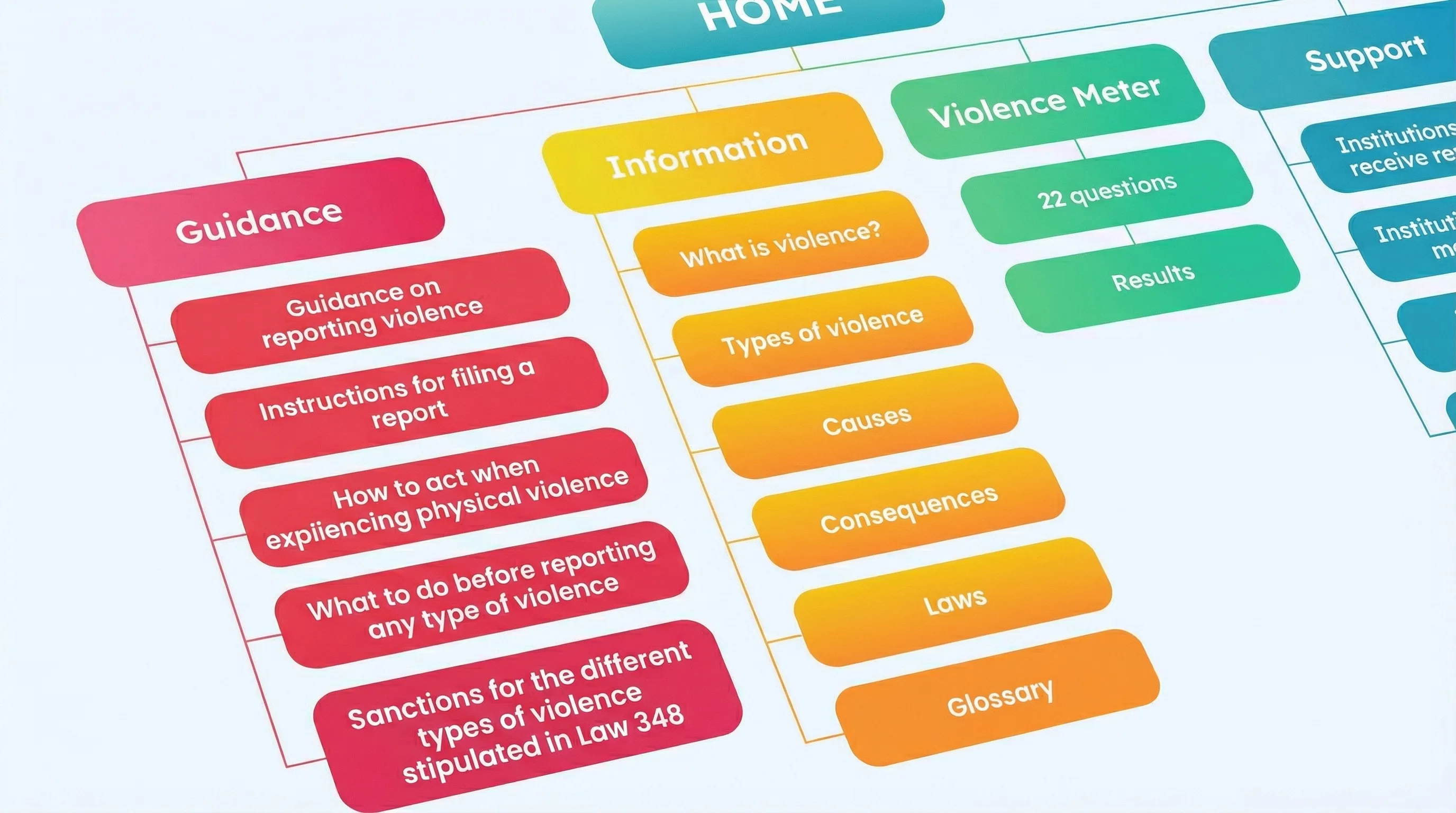
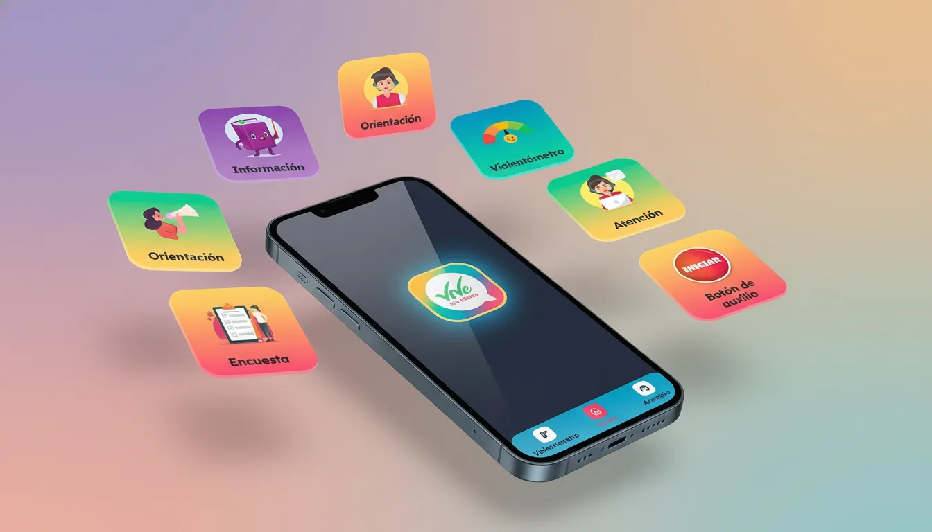
The app is organised in two phases. The first is informational: rights, types of violence and how to report. The second is action: the violence meter, the map and the panic button. The flow takes the user from understanding to acting.
Conclusion
Vive Sin Miedo is published on Google Play with 4.6 stars. It is used by women in the mining areas of Oruro and other regions of Bolivia as a prevention and emergency tool. The project shows that user-centred design can save lives when it is done with the right context.
Services
Stack
App screens
22 · scroll sideways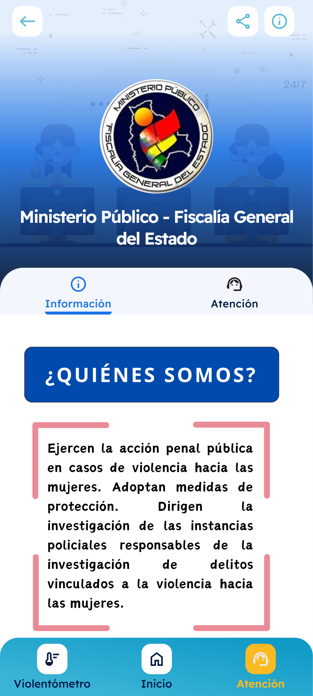
Have something similar in mind?
Tell us what you need: we look at it together and propose a way forward in writing, in English or Spanish.
[email protected]